Note : The Bar Plot mainly used to summarize the categorical variable.
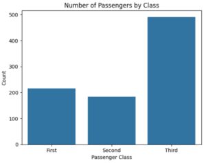
(2) Where to Use a Bar Plot ?
(3) Example Of Bar Plot ?
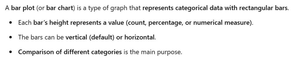
Example-1: Titanic Passenger Class Vs Count.
import seaborn as sns
import matplotlib.pyplot as plt

# Load dataset
titanic = sns.load_dataset("titanic")

# Create Bar Plot (Count of passengers by class)
sns.barplot(x=titanic["class"].value_counts().index, y=titanic["class"].value_counts().values)

plt.title("Number of Passengers by Class")
plt.xlabel("Passenger Class")
plt.ylabel("Count")
plt.show()
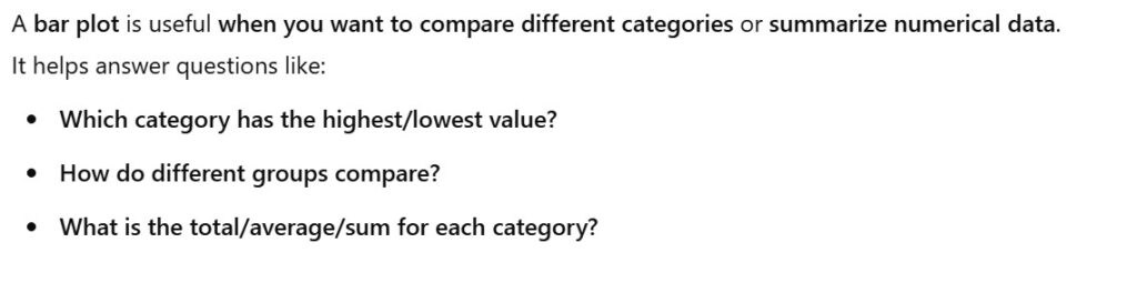
Example-2: Bar PLOT With The Count On Top
import seaborn as sns
import matplotlib.pyplot as plt

titanic = sns.load_dataset('titanic')

plt.figure(figsize=(7, 6))
ax = sns.barplot(data = titanic, x = 'class', y = 'fare', estimator = 'sum', errorbar = None)

ax.bar_label(ax.containers[0], fmt="%.0f", padding=3 )

plt.title('Total Fare Collected By Class')
plt.xlabel('Class')
plt.ylabel('Total Fare')
plt.show()
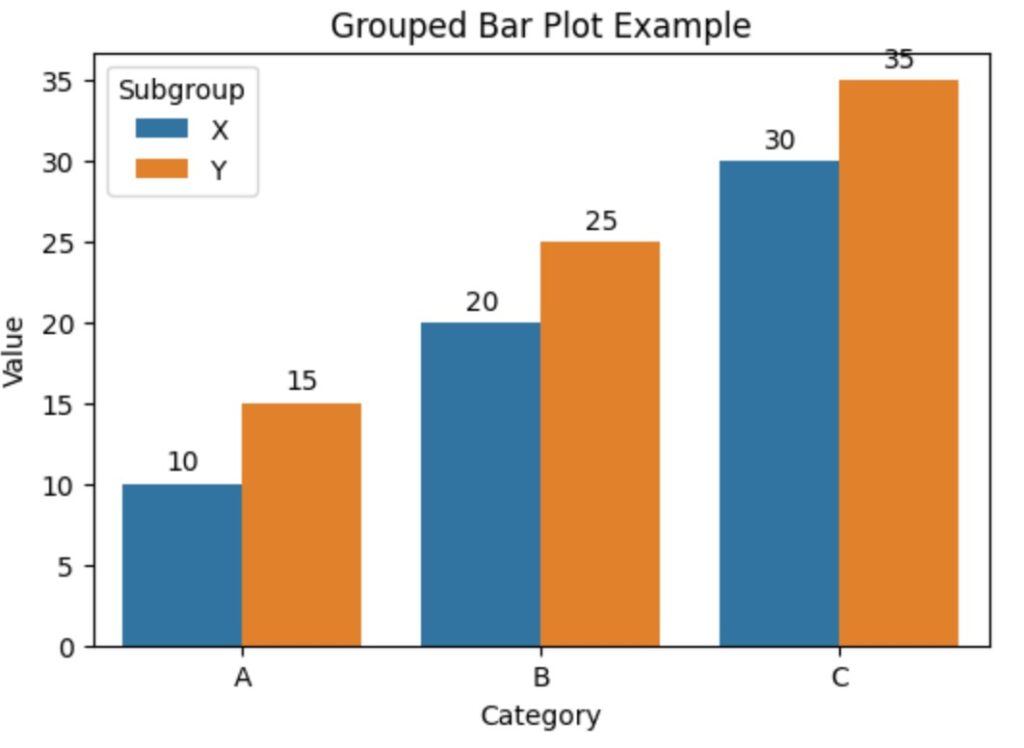
Example-3: Multiple Sets of Bars (Grouped Bar Plot)
import seaborn as sns
import matplotlib.pyplot as plt

# Sample Data
data = {
    "Category": ["A", "A", "B", "B", "C", "C"],
    "Subgroup": ["X", "Y", "X", "Y", "X", "Y"],
    "Value": [10, 15, 20, 25, 30, 35],
}

# Convert to DataFrame
import pandas as pd
df = pd.DataFrame(data)

# Create a grouped bar plot
plt.figure(figsize=(6, 4))
ax = sns.barplot(data=df, x="Category", y="Value", hue="Subgroup", errorbar=None)

# Print `ax.containers`
print(ax.containers)  # Output: Two BarContainers

# Add labels to each group of bars
ax.bar_label(ax.containers[0], fmt="%.0f", padding=3, label_type="edge")  # First set of bars (X)
ax.bar_label(ax.containers[1], fmt="%.0f", padding=3, label_type="edge")  # Second set of bars (Y)

# Labels and title
plt.title("Grouped Bar Plot Example")
plt.xlabel("Category")
plt.ylabel("Value")
plt.legend(title="Subgroup")
plt.show()
‘hue’ is used to compare subcategories within each main category.