admin
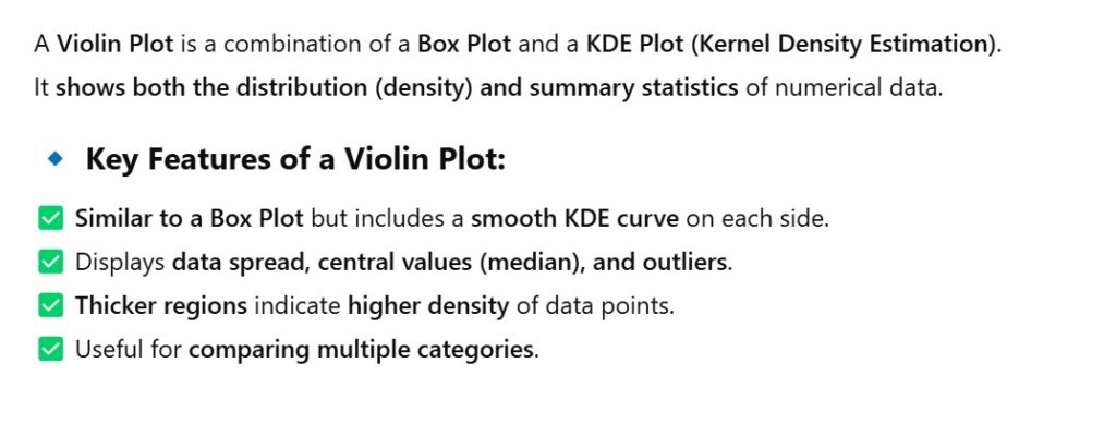
import seaborn as sns
import matplotlib.pyplot as plt

# Load Titanic dataset
titanic = sns.load_dataset("titanic")

# Create a violin plot for passenger fare
sns.violinplot(data=titanic, x="fare")

plt.xlabel("Fare ($)")
plt.title("Violin Plot of Passenger Fare")
plt.show()
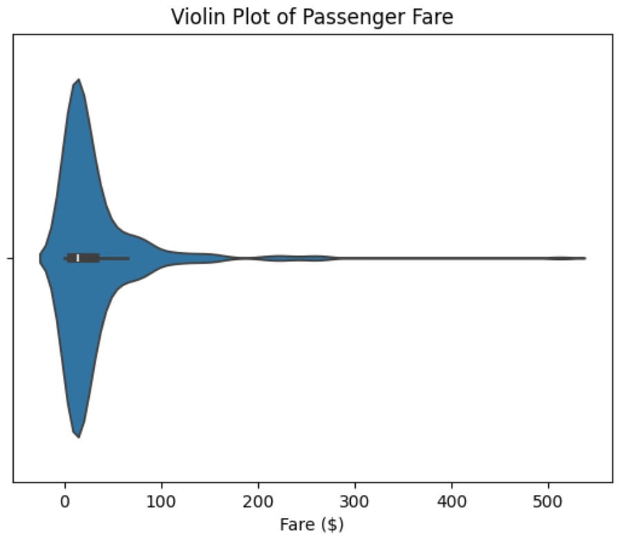
import seaborn as sns
import matplotlib.pyplot as plt

# Load Titanic dataset
titanic = sns.load_dataset("titanic")

# Create a violin plot for passenger fare
sns.violinplot(data=titanic, x="class", y="fare")

plt.xlabel("Fare ($)")
plt.title("Violin Plot of Passenger Fare")
plt.show()
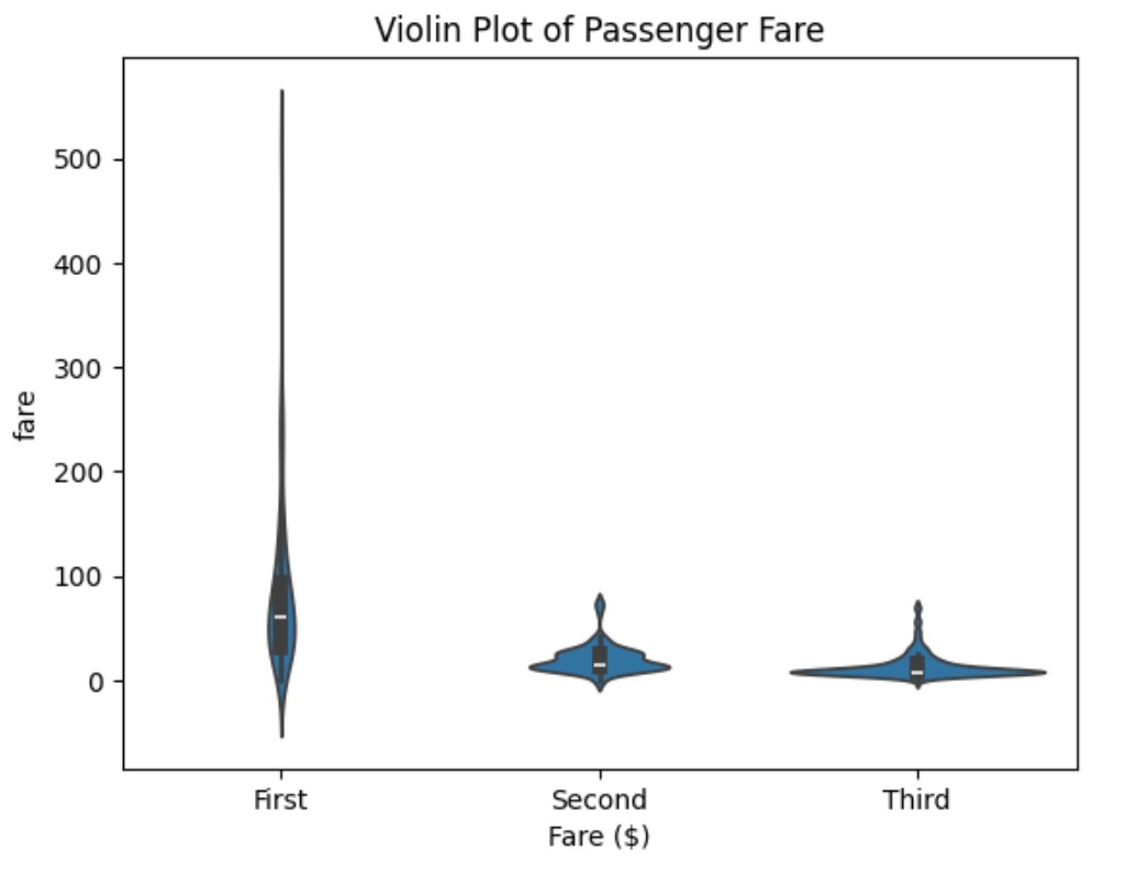
import seaborn as sns
import matplotlib.pyplot as plt

# Load Titanic dataset
titanic = sns.load_dataset("titanic")

# Create a violin plot for passenger fare
sns.violinplot(data=titanic, x="class", y="fare", hue="sex", split=True)

plt.xlabel("Fare ($)")
plt.title("Violin Plot of Passenger Fare")
plt.show()
Your email address will not be published. Required fields are marked *
Comment *
Name *
Email *
Website
Save my name, email, and website in this browser for the next time I comment.