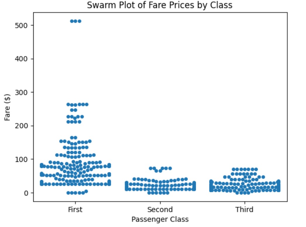
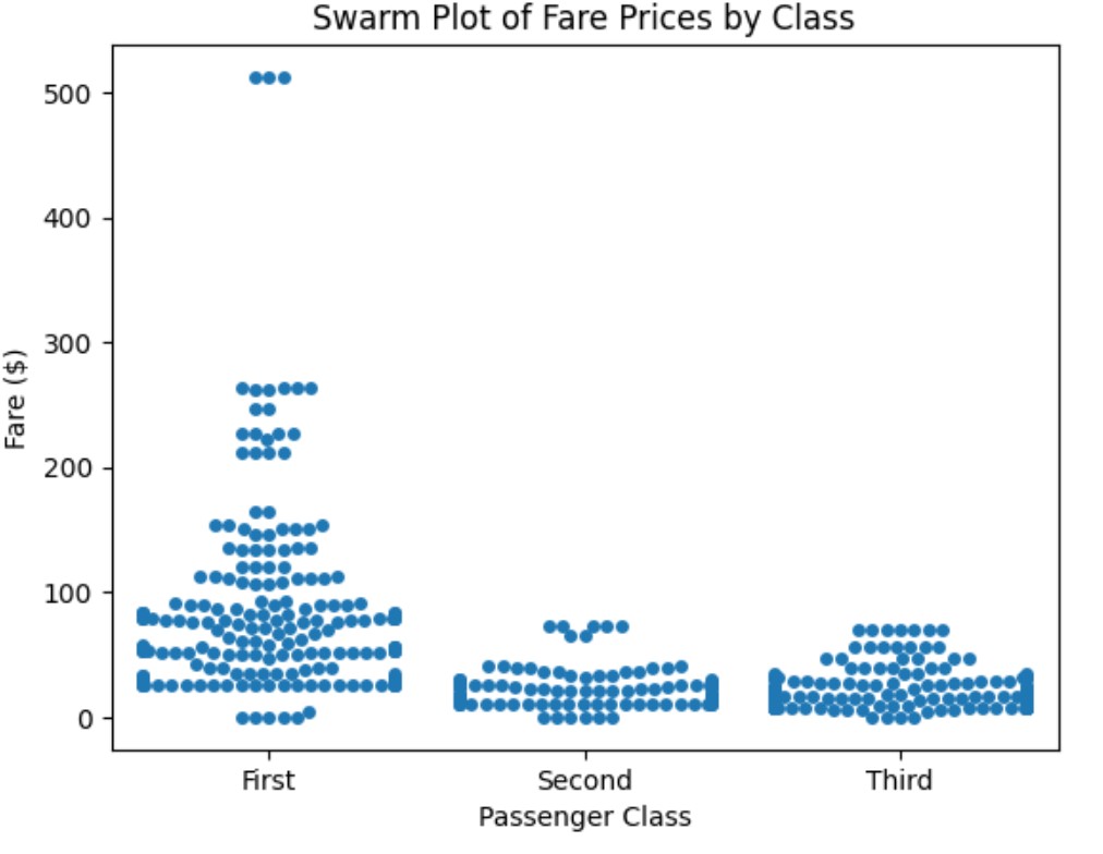
import seaborn as sns
import matplotlib.pyplot as plt

# Load Titanic dataset
titanic = sns.load_dataset("titanic")

# Create a swarm plot for fare distribution
sns.swarmplot(data=titanic, x="class", y="fare")

plt.xlabel("Passenger Class")
plt.ylabel("Fare ($)")
plt.title("Swarm Plot of Fare Prices by Class")
plt.show()
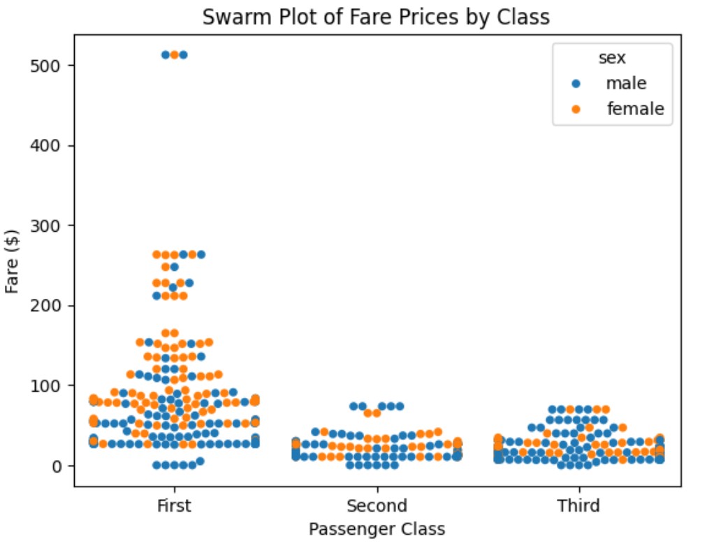
Example-2: Swarm Plot with Hue (Gender Comparison)
import seaborn as sns
import matplotlib.pyplot as plt

# Load Titanic dataset
titanic = sns.load_dataset("titanic")

# Create a swarm plot for fare distribution
sns.swarmplot(data=titanic, x="class", y="fare", hue="sex")

plt.xlabel("Passenger Class")
plt.ylabel("Fare ($)")
plt.title("Swarm Plot of Fare Prices by Class")
plt.show()
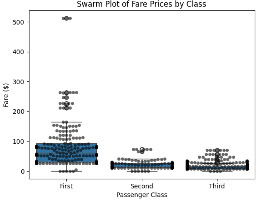
Example-3: Swarm Plot + Box Plot
import seaborn as sns
import matplotlib.pyplot as plt

# Load Titanic dataset
titanic = sns.load_dataset("titanic")

# Create a swarm plot for fare distribution
sns.boxplot(data=titanic, x="class", y="fare")
sns.swarmplot(data=titanic, x="class", y="fare", color="black", alpha=0.6)

plt.xlabel("Passenger Class")
plt.ylabel("Fare ($)")
plt.title("Swarm Plot of Fare Prices by Class")
plt.show()