-
Seaborn – Q – Q Plot
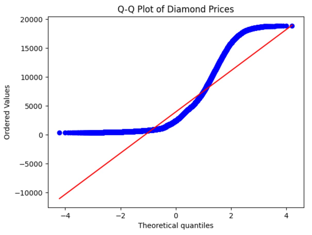
Linear Regression – Assumption- 1 (Linear Relationship) Table Of Contents: What Is Q – Q Plot ? Example Of Q – Q Plot . Why There Is A Straight Line In The Q – Q Plot ? (1) What Is Q – Q Plot ? A Q–Q plot (Quantile–Quantile plot) is a probability plot that compares the quantiles of a dataset to the quantiles of a theoretical distribution (often the normal distribution). It helps to visually check if your data is normally distributed. (2) When to use a Q–Q Plot ? To assess normality (Is my data normally distributed?) To
-
Seaborn – Interactive Seaborn With Plotly
-
Seaborn – Combining Multiple Plots
-
Seaborn – Working With Big Datasets
-
Seaborn – Saving Plots
-
Seaborn – Adjusting Figure Size
-
Seaborn – Changing colors & Palettes
-
Seaborn – Polynomial Regression Trend Visualization
-
Seaborn – Logistic Regression Visualization