-
Seaborn – Count Plot Visualization
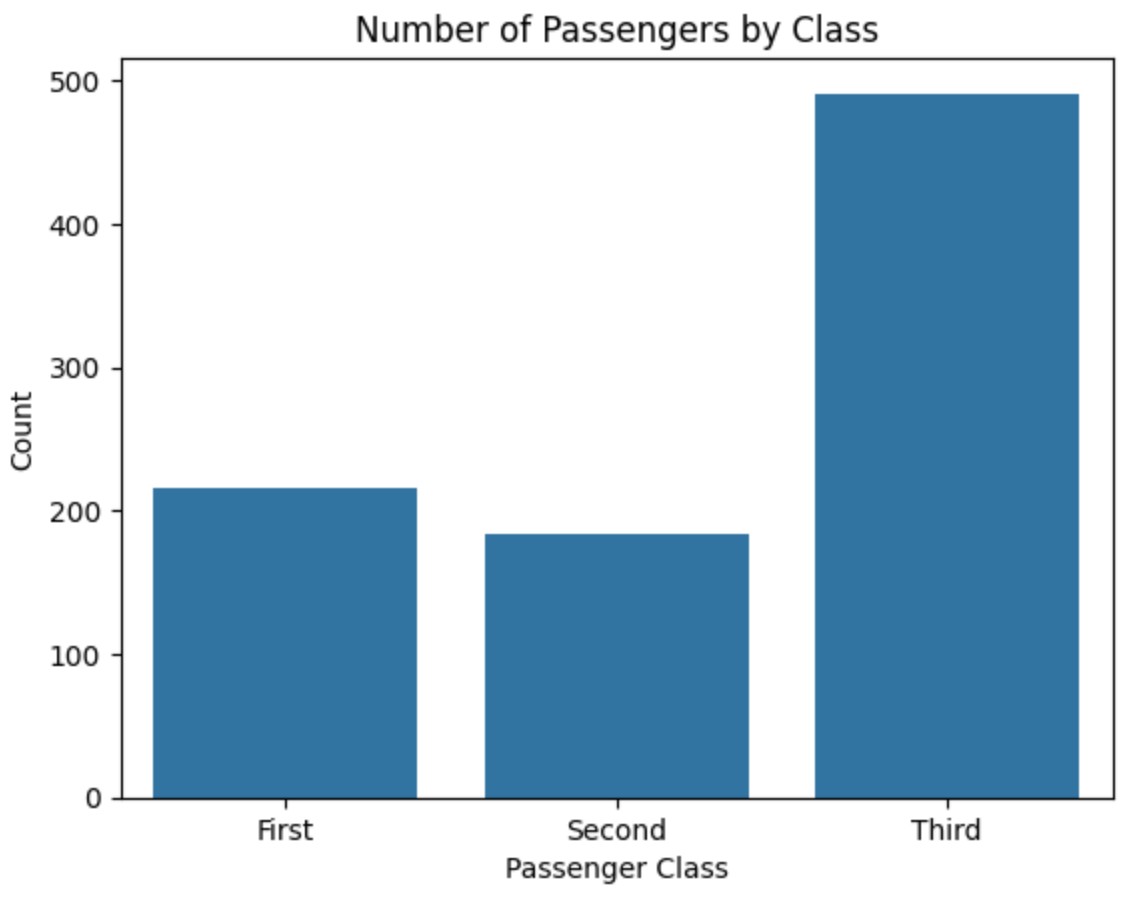
Seaborn – Count Plot Visualization Table Of Contents: What Is Count Plot ? Where To Use Count Plot ? Examples Of Count Plot ? (1) What Is Count Plot ? A count plot is a type of bar plot that shows the count (frequency) of occurrences of different categories in a dataset. It is useful when you want to visualize categorical data and see how often each category appears. (2) Where To Use Count Plot ? (3) Example Of Count Plot. Example-1: Titanic Passenger Class Vs Count. import seaborn as sns import matplotlib.pyplot as plt # Load the Titanic dataset
-
Seaborn – Bar Plot Visualization
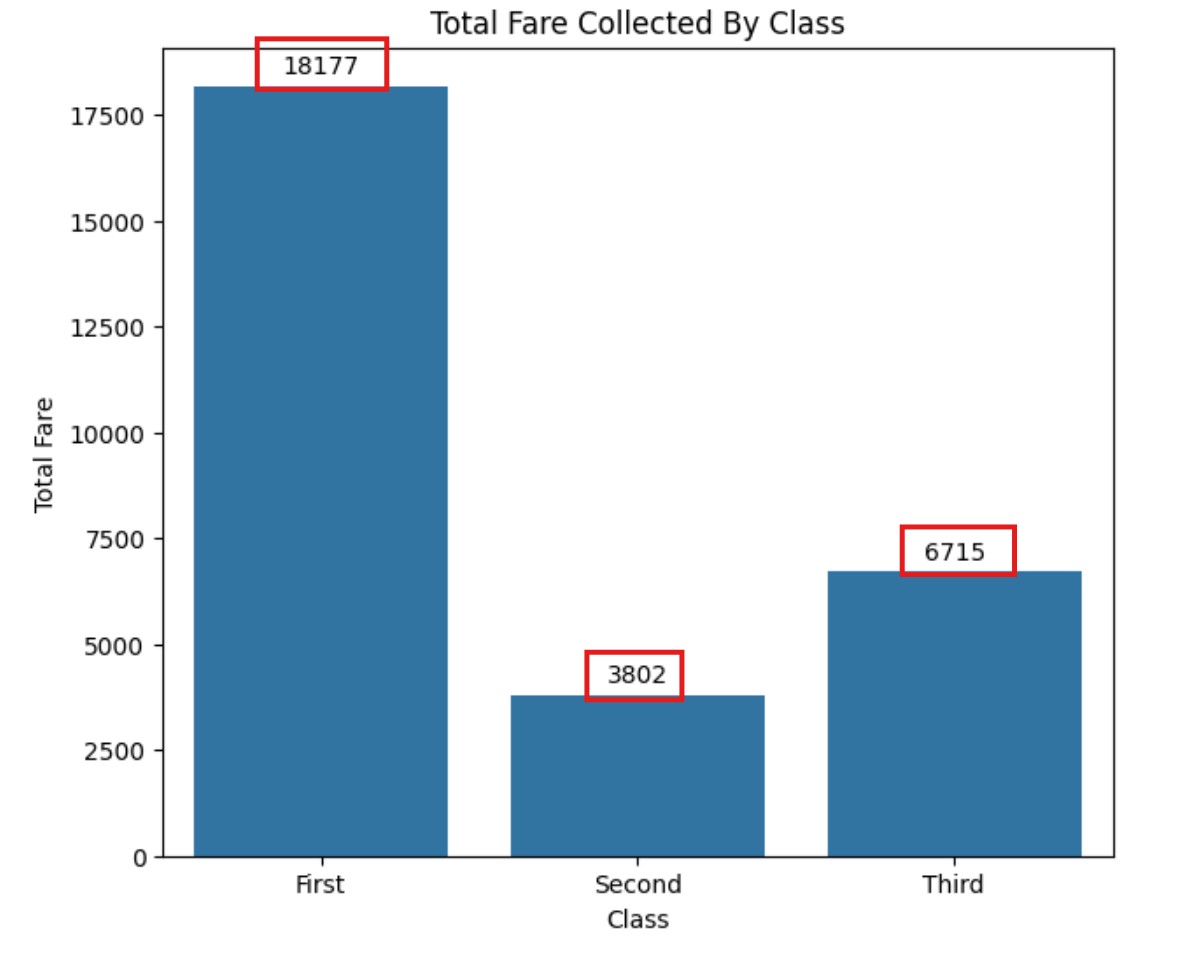
Seaborn – Bar Plot Visualization Table Of Contents: What Is Bar Plot ? Where To Use Bar Plot ? Examples Of Bar Plot ? (1) What Is Bar Plot ? Note : The Bar Plot mainly used to summarize the categorical variable. (2) Where to Use a Bar Plot ? (3) Example Of Bar Plot ? Example-1: Titanic Passenger Class Vs Count. import seaborn as sns import matplotlib.pyplot as plt # Load dataset titanic = sns.load_dataset("titanic") # Create Bar Plot (Count of passengers by class) sns.barplot(x=titanic["class"].value_counts().index, y=titanic["class"].value_counts().values) plt.title("Number of Passengers by Class") plt.xlabel("Passenger Class") plt.ylabel("Count") plt.show() Example-2: Bar PLOT With
-
Seaborn – Scatter Plot Visualization
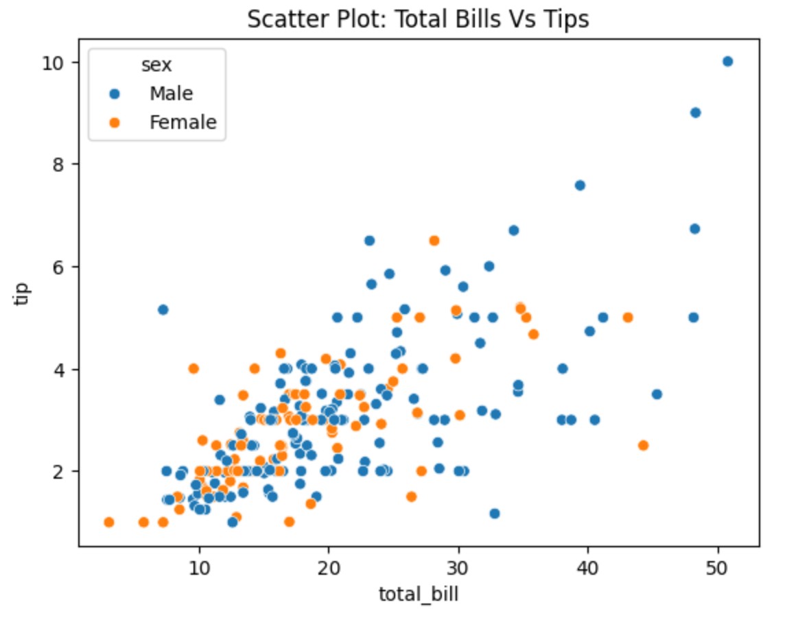
Seaborn – Scatter Plot Visualization Table Of Contents: What Is Scatter Plot? Example Of Scatter Plot. (1) What Is Scatter Plot ? A scatter plot visually represents the relationship between two numerical variables. It helps you see if there is a correlation (positive, negative, or none) between them based on how the data points are spread out. The pattern or distribution of the points gives you insights into the correlation. Best when comparing two independent variables without time dependency. Example-1: Total Bill vs Tips import seaborn as sns import matplotlib.pyplot as plt # Load Seaborn Builtin 'tips' Dataset tips =
-
Seaborn – Line Plot Visualization
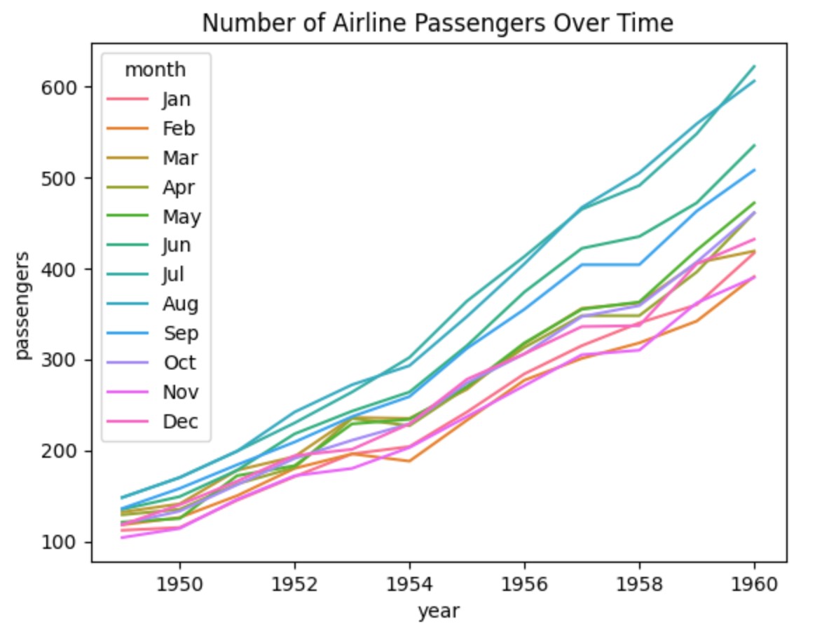
Seaborn – Line Plot Visualization Table Of Contents: What Is Line Plot? Example Of Line Plot. (1) What Is Line Plot ? A line plot is a type of graph that shows how something changes over time or along a continuous variable. It connects data points with a line to show trends and patterns. Example-1: Basic Line Plot import seaborn as sns import matplotlib.pyplot as plt # Sample Data data = { "year": [2015, 2016, 2017, 2018, 2019, 2020, 2021], "sales": [50, 55, 60, 80, 90, 100, 120] } # Create the plot sns.lineplot(x=data["year"], y=data["sales"]) # Show the plot plt.title("Sales
-

Seaborn – Basic Plot Types
Seaborn – Basic Plot Types Table Of Contents: Line Plot (sns.lineplot()) Scatter Plot (sns.scatterplot()) Bar Plot (sns.barplot()) Count Plot (sns.countplot()) Histogram (sns.histplot()) KDE Plot (sns.kdeplot()) (1) Line Plot (sns.lineplot()) A line plot is a type of graph that shows how something changes over time or along a continuous variable. It connects data points with a line to show trends and patterns. Example-1: Basic Line Plot import seaborn as sns import matplotlib.pyplot as plt # Sample Data data = { "year": [2015, 2016, 2017, 2018, 2019, 2020, 2021], "sales": [50, 55, 60, 80, 90, 100, 120] } # Create the plot
-

Seaborn – Basics Of Seaborn & Setup
Seaborn – Basics of Seaborn & Setup Table Of Contents: What is Seaborn? Why use it over Matplotlib? Installing Seaborn (pip install seaborn) Importing Seaborn & Matplotlib (import seaborn as sns) Understanding Seaborn’s built-in datasets (sns.get_dataset_names()) Loading datasets (sns.load_dataset(“tips”)) (1) What is Seaborn? Why Use It Over Matplotlib? What Is Seaborn? Why Use It Over Matplotlib ? (2) Installing Seaborn Library pip install seaborn (3) Verify The Installation pip show seaborn (4) Importing Seaborn & Matplotlib (import seaborn as sns) import seaborn as sns import matplotlib.pyplot as plt (5) Understanding Seaborn’s Built-in Datasets. import seaborn as sns # Get The
-

Seaborn – Syllabus For Data Visualization
Seaborn – Learning Syllabus Table Of Contents: Basics of Seaborn & Setup Basic Plot Types Advanced Statistical Plots Pairwise Relationships & Correlation Plots Categorical Data Visualization Regression & Trend Analysis Customizing Seaborn Plots Working with Large Datasets & Complex Visualizations (1) Basics of Seaborn & Setup What is Seaborn? Why use it over Matplotlib? Installing Seaborn (pip install seaborn) Importing Seaborn & Matplotlib (import seaborn as sns) Understanding Seaborn’s built-in datasets (sns.get_dataset_names()) Loading datasets (sns.load_dataset(“tips”)) (2) Basic Plot Types Line Plot (sns.lineplot()) Scatter Plot (sns.scatterplot()) Bar Plot (sns.barplot()) Count Plot (sns.countplot()) Histogram (sns.histplot()) KDE Plot (sns.kdeplot()) (3) Advanced Statistical Plots
-

Seaborn – Data Visualization
Seaborn – Syllabus For Data Visualization admin April 2, 2025 Seaborn – Data Visualization Read More Seaborn – Basics Of Seaborn & Setup admin April 2, 2025 Seaborn – Data Visualization Read More Seaborn – Basic Plot Types admin April 2, 2025 Seaborn – Data Visualization Read More Seaborn – Line Plot Visualization admin April 3, 2025 Seaborn – Data Visualization Read More Seaborn – Scatter Plot Visualization admin April 3, 2025 Seaborn – Data Visualization Read More Seaborn – Bar Plot Visualization admin April 3, 2025 Seaborn – Data Visualization Read More Seaborn – Count Plot Visualization admin April