
Outlier Detection Techniques
Table Of Contents:
- What Is An Outlier ?
- Characteristics Of An Outlier.
- Causes Of Outlier.
- Why Handle Outliers?
- Outlier Handling Techniques.
- Python Examples.
(1) What Is An Outlier?

- An outlier is a data point that significantly deviates from the rest of the dataset.
- It is unusually large or small compared to other values and may indicate variability, errors, or rare events.
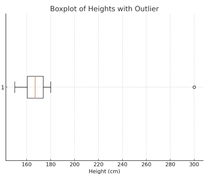
(2) Example Of An Outlier.
Data Set: 150, 160, 162, 158, 170, 165, 175, 169, 180, 300.
In this example, the height 300 cm is an outlier because it is much higher than the other values, which are more closely clustered around the 150-180 cm range.
The 300 cm value is far outside the typical range for human heights, making it an outlier.
(3) Characteristics Of An Outlier.
- Extreme Value: Far from the majority of data points.
- Infrequent Occurrence: Often appears rarely in the dataset.
- Influential Impact: Can heavily influence statistical calculations like the mean or variance.
(4) Causes Of Outliers.
- Measurement Errors: Mistakes in data entry or collection.
- Natural Variability: True but rare events (e.g., extremely high stock prices).
- Sampling Issues: Including unrelated or incorrect samples.
(5) Why To Handle Outliers.
- Skew statistical analysis.
- Mislead machine learning models.
- Distort visualizations and interpretations.
(6) Outliers Handling Techniques
(1) Identify Outliers
(a) Visual Methods
- Box plots
- Scatter plots
(b) Statistical Methods
- Z-Score: Values with a Z-score > 3 or < -3 are potential outliers.
- Interquartile Range (IQR):
- IQR=Q3−Q1
- Outliers: Values < Q1−1.5×IQR or > Q3+1.5×IQR
(2) Techniques To Handle Outliers
(a) Remove Outliers
- When: If the outliers are errors or irrelevant.
- How:
- Remove rows based on Z-scores or IQR thresholds.
(b) Transform Outliers
- When: To reduce the impact of outliers on statistical measures.
- How:
- Apply log, square root, or Box-Cox transformations.
(c) Cap Outliers(Winsorization)
- When: To limit the effect of extreme values without removing data.
- How:
- Replace outliers with the nearest acceptable value (e.g., Q1−1.5×IQR or Q3+1.5×IQR).
(d) Impute Outliers
- When: To retain the data while normalizing its effect.
- How:
- Replace outliers with mean, median, or a predicted value.
(e) Use Robust Models
- When: To minimize sensitivity to outliers during analysis or modeling.
- How:
- Use models like robust regression or tree-based algorithms that handle outliers naturally.
(7) Box Plot Example.
What Is A Box Plot?
- A box plot (also known as a box-and-whisker plot) is a graphical representation of the distribution of a dataset.
- It provides a visual summary of the data’s central tendency, spread, and potential outliers.
Components Of Box Plot.

Box:
- Represents the interquartile range (IQR), which contains the middle 50% of the data.
- The bottom of the box marks the first quartile (Q1), and the top marks the third quartile (Q3).
- The line inside the box indicates the median (Q2) of the data.
Whiskers:
- Extend from the box to the smallest and largest data points within a defined range.
- The range is usually calculated as:
- Lower Whisker: Extends to the smallest data point within Q1−1.5×IQR.
- Upper Whisker: Extends to the largest data point within Q3+1.5×IQR.
Outliers:
- Data points outside the whiskers are plotted individually and are considered potential outliers.
Features of a Box Plot:
Box:
- Represents the interquartile range (IQR), which contains the middle 50% of the data.
- The bottom of the box marks the first quartile (Q1), and the top marks the third quartile (Q3).
- The line inside the box indicates the median (Q2) of the data.
Whiskers:
- Extend from the box to the smallest and largest data points within a defined range.
- The range is usually calculated as:
- Lower Whisker: Extends to the smallest data point within Q1−1.5×IQR.
- Upper Whisker: Extends to the largest data point within Q3+1.5×IQR.
Outliers:
- Data points outside the whiskers are plotted individually and are considered potential outliers.
Example of a Box Plot:
- Here is the box plot for the dataset [3,6,7,8,9,10,15,25,50][3, 6, 7, 8, 9, 10, 15, 25, 50][3,6,7,8,9,10,15,25,50].
Box:
- Spans from Q1=7.5 to Q3=15, representing the middle 50% of the data.
Median:
- The red line inside the box represents the median (Q2=9).
Whiskers:
- Lower Whisker: Extends to Q1−1.5×IQR, adjusted to min(data)=3.
- Upper Whisker: Extends to Q3+1.5×IQR, adjusted to 25.
Outlier:
- The value 50 is an outlier and is marked as an orange dot.

(8) What Is An Scatter Plot?
What Is A Scatter Plot?
- A scatter plot is a type of data visualization that displays individual data points on a two-dimensional graph.
- It is commonly used to observe and analyze relationships or patterns between two numerical variables.
- Each point on the plot represents a single data observation, with the following characteristics:
- X-axis: Represents one variable.
- Y-axis: Represents another variable.
- Points: The position of each point is determined by the values of the two variables for that observation.
Key Features:
Correlation:
- Scatter plots reveal relationships between variables, such as positive, negative, or no correlation.
- A positive correlation means as one variable increases, the other also increases.
- A negative correlation means as one variable increases, the other decreases.
- No correlation indicates no discernible relationship.
Outliers:
- Points that fall far outside the general pattern can be visually identified as outliers.
Clusters:
- Data points can form clusters, which may indicate subgroups or patterns within the data.
Example Of Finding Outlier:
- Identifying outliers for a single column using a scatter plot involves visualizing the data in a way that highlights deviations from the central tendency.
- Since a scatter plot typically requires two dimensions, you can plot the index of the data points on the x-axis and the column values on the y-axis.
- Here’s how you can do it:
Steps:
- Plot the values of the column against their indices.
- Identify statistical measures (e.g., mean, standard deviation, interquartile range) to determine thresholds for outliers.
- Mark points that fall outside these thresholds (e.g., 1.5 times the interquartile range or more than 3 standard deviations away from the mean).
# Generating synthetic data for a single column
np.random.seed(42)
data = np.random.normal(50, 10, 100)  # Normal distribution around 50, std 10

# Adding outliers
outliers = np.array([20, 80, 100])
data_with_outliers = np.concatenate([data, outliers])

# Identifying outliers using the 1.5 IQR rule
q1, q3 = np.percentile(data_with_outliers, [25, 75])
iqr = q3 - q1
lower_bound = q1 - 1.5 * iqr
upper_bound = q3 + 1.5 * iqr
outlier_indices = np.where((data_with_outliers < lower_bound) | (data_with_outliers > upper_bound))[0]

# Plotting
plt.figure(figsize=(10, 6))
plt.scatter(range(len(data_with_outliers)), data_with_outliers, color='blue', label='Data Points')
plt.scatter(outlier_indices, data_with_outliers[outlier_indices], color='red', label='Outliers', edgecolor='black')
plt.axhline(lower_bound, color='green', linestyle='--', label=f"Lower Bound ({lower_bound:.2f})")
plt.axhline(upper_bound, color='purple', linestyle='--', label=f"Upper Bound ({upper_bound:.2f})")
plt.title("Outlier Detection in a Single Column", fontsize=16)
plt.xlabel("Index", fontsize=12)
plt.ylabel("Value", fontsize=12)
plt.legend(fontsize=10)
plt.grid(alpha=0.4)
plt.show()

Here is an example of a scatter plot showing outlier detection for a single column.
- The blue points represent the data values.
- The red points are identified as outliers based on the 1.5 IQR rule.
- The green and purple dashed lines denote the lower and upper bounds, respectively, used for outlier detection.