Linear Regression – Assumption- 1 (Linear Relationship)
Table Of Contents:
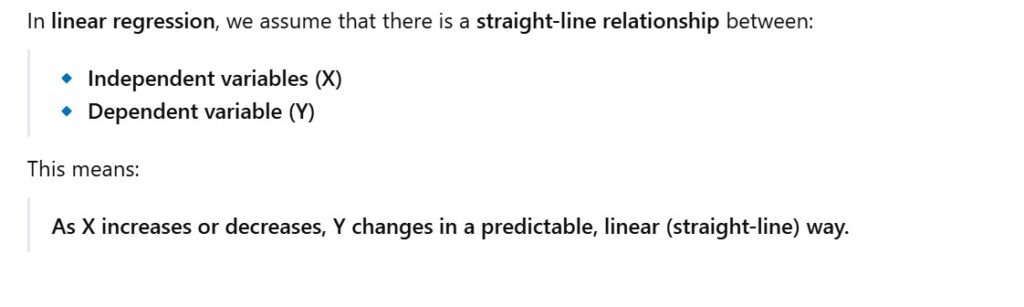
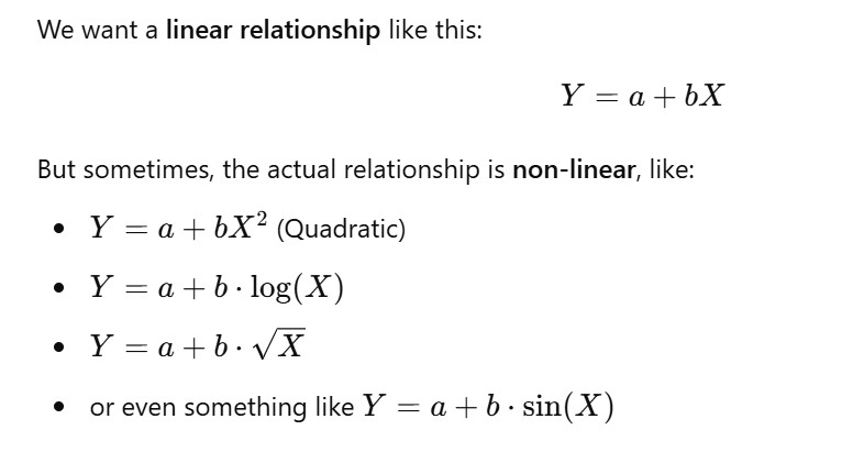
What Is Linear Relationship Assumption ?
Why Linear Regression Assumption Is Important ?
How To Check Linearity Between Dependent & Independent Variable ?
How The Residuals Can Say About The Linearity ?
What To Do If You Have Non Linearity Present In The Data ?
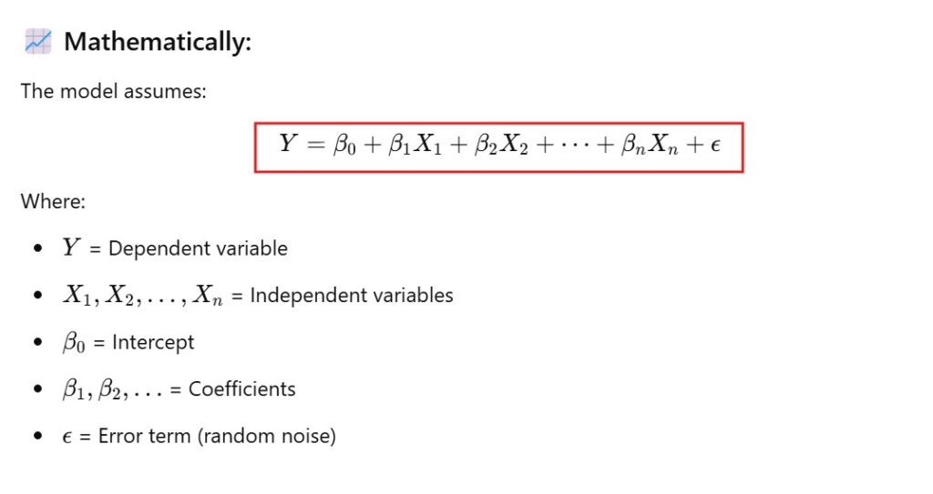
(1) What Is Linear Relationship Assumption ?
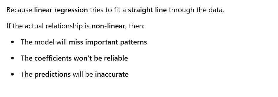
(2) What Is Linear Relationship Assumption Important ?
(3) How To Check Linearity Between Dependent & Independent Variable ?
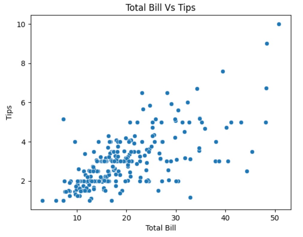
(1) Using Scatter Plot
import seaborn as sns
import matplotlib.pyplot as plt

# Load a real dataset
tips = sns.load_dataset("tips")

# Scatter plot: total_bill vs. tip
sns.scatterplot(x="total_bill", y="tip", data=tips)

plt.title("Scatter Plot: Total Bill vs Tip")
plt.xlabel("Total Bill ($)")
plt.ylabel("Tip ($)")
plt.grid(True)
plt.show()
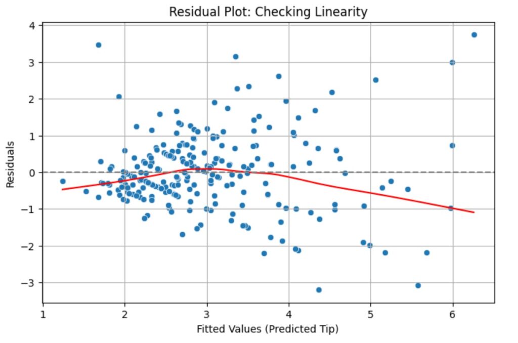
(2) Using Residual Plot
A residual plot is one of the best tools to visually check whether the linearity assumption holds in linear regression.
Let’s walk through a real-world example using the tips dataset from Seaborn again, and we’ll:
Fit a linear regression model: tip ~ total_bill
Plot the residualsto check linearity.
import seaborn as sns
import matplotlib.pyplot as plt
import statsmodels.api as sm
import numpy as np

# Load dataset
tips = sns.load_dataset("tips")

# Independent (X) and Dependent (y) variables
X = tips["total_bill"]
y = tips["tip"]

# Add constant to X for intercept
X = sm.add_constant(X)

# Fit linear regression model
model = sm.OLS(y, X).fit()

# Get predictions and residuals
predictions = model.predict(X)
residuals = y - predictions

# Plot residuals vs predicted values
plt.figure(figsize=(8, 5))
sns.scatterplot(x=predictions, y=residuals)

# LOWESS red line (trend line through residuals)
lowess = sm.nonparametric.lowess
lowess_smoothed = lowess(residuals, predictions)
plt.plot(lowess_smoothed[:, 0], lowess_smoothed[:, 1], color='red')

# Reference horizontal line at zero
plt.axhline(0, linestyle='--', color='gray')

# Labels and title
plt.xlabel("Fitted Values (Predicted Tip)")
plt.ylabel("Residuals")
plt.title("Residual Plot: Checking Linearity")
plt.grid(True)
plt.show()
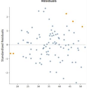
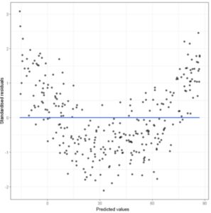
(4) How The Residuals Can Say About The Linearity ?
From the residual we will get to know what the model is missing.
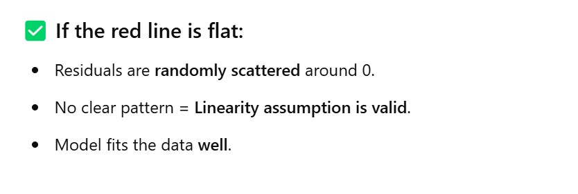
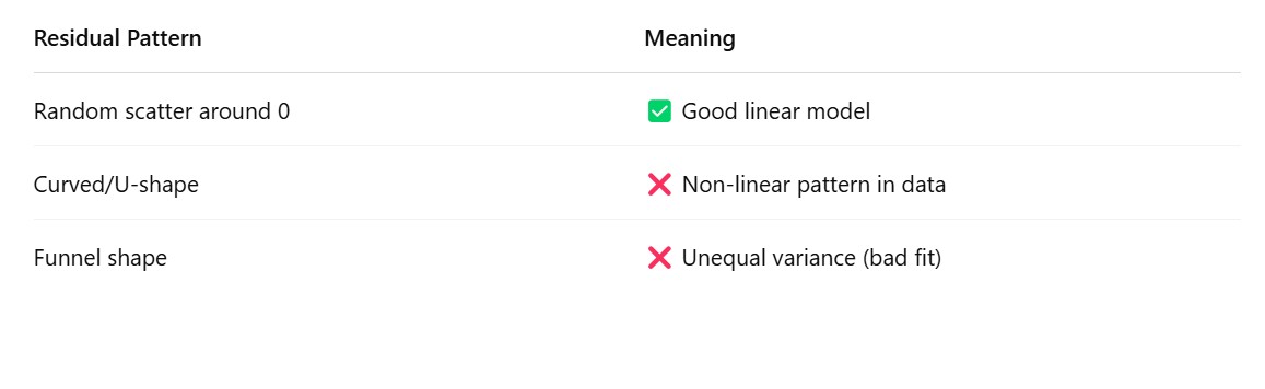
If the residuals are scattered means model is not missing anything. It is the random error produced.
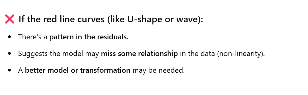
If the residuals having some pattern means your linear regression model not able to capture the non linear pattern in the dataset. That’s why you are seeing the pattern.
(1) Residual Plot – No Pattern Observed
(2) Residual Plot – ‘U’ Shape Pattern Observed.
(5) What To Do If You Have Non Linearity Present In The Data ?
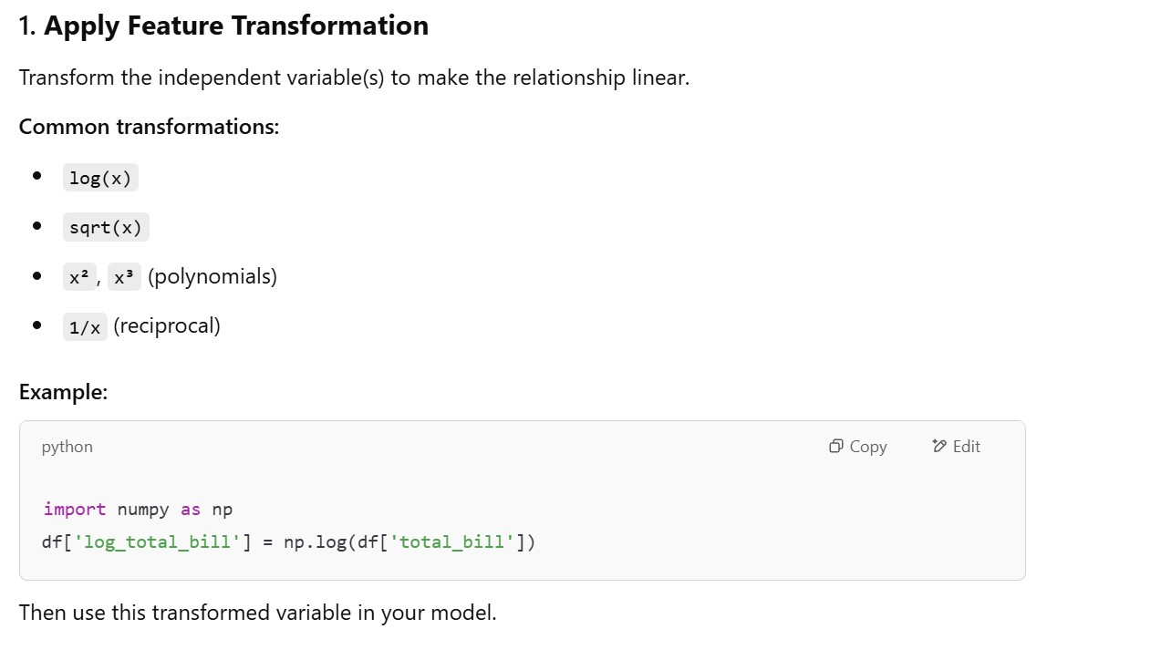
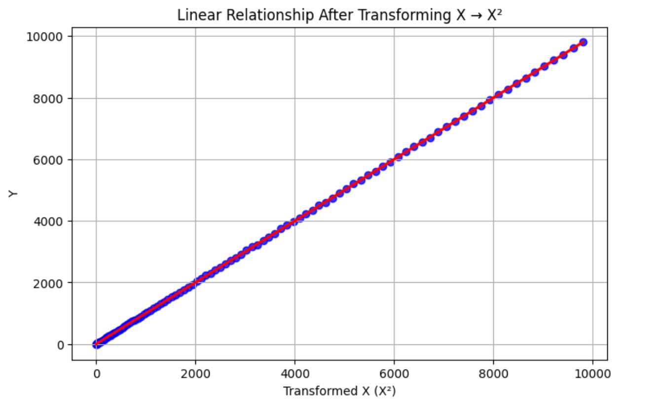
(1) Apply Feature Transformation
The problem in the Non Linearity is that the independent variables are not able to explain the dependent variables in linear way.
Hence we need to transform the independent variables to capture the non linearity in the dependent variable.
import numpy as np
import matplotlib.pyplot as plt
import seaborn as sns
import pandas as pd
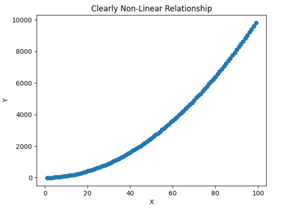
# Original nonlinear data
X = np.arange(1, 100)
Y = X**2 + np.random.normal(0, 10, 99)
# Transform X (square) to linearize
X_transformed = X**2
# Plot the transformed relationship
plt.figure(figsize=(8, 5))
sns.regplot(x=X_transformed, y=Y, scatter_kws={"color": "blue"}, line_kws={"color": "red"})
plt.title("Linear Relationship After Transforming X → X²")
plt.xlabel("Transformed X (X²)")
plt.ylabel("Y")
plt.grid(True)
plt.show()
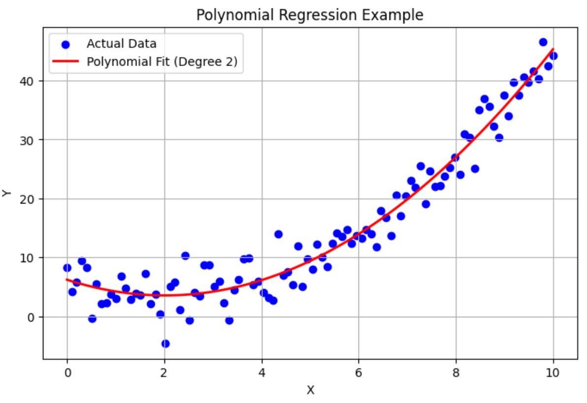
(2) Use Polynomial Regression
Add higher-order terms (like x², x³) to capture the curve.
import numpy as np
import matplotlib.pyplot as plt
from sklearn.linear_model import LinearRegression
from sklearn.preprocessing import PolynomialFeatures
from sklearn.pipeline import make_pipeline

# Step 1: Create non-linear data
np.random.seed(0)
X = np.linspace(0, 10, 100)
y = 0.5 * X**2 - X + 3 + np.random.normal(0, 3, size=X.shape)  # Quadratic relationship with noise

X = X.reshape(-1, 1)  # Reshape for sklearn

# Step 2: Create a pipeline for Polynomial Regression (degree = 2)
model = make_pipeline(PolynomialFeatures(degree=2), LinearRegression())

# Step 3: Fit the model
model.fit(X, y)

# Step 4: Predict
y_pred = model.predict(X)

# Step 5: Plot
plt.figure(figsize=(8, 5))
plt.scatter(X, y, color='blue', label='Actual Data')
plt.plot(X, y_pred, color='red', linewidth=2, label='Polynomial Fit (Degree 2)')
plt.title("Polynomial Regression Example")
plt.xlabel("X")
plt.ylabel("Y")
plt.legend()
plt.grid(True)
plt.show()
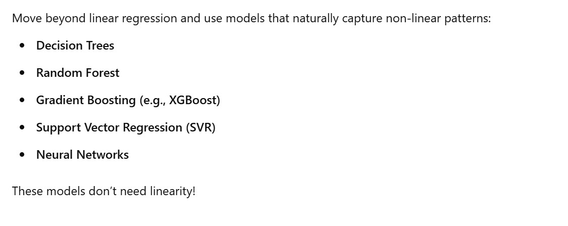
(3) Try Non Linear Models
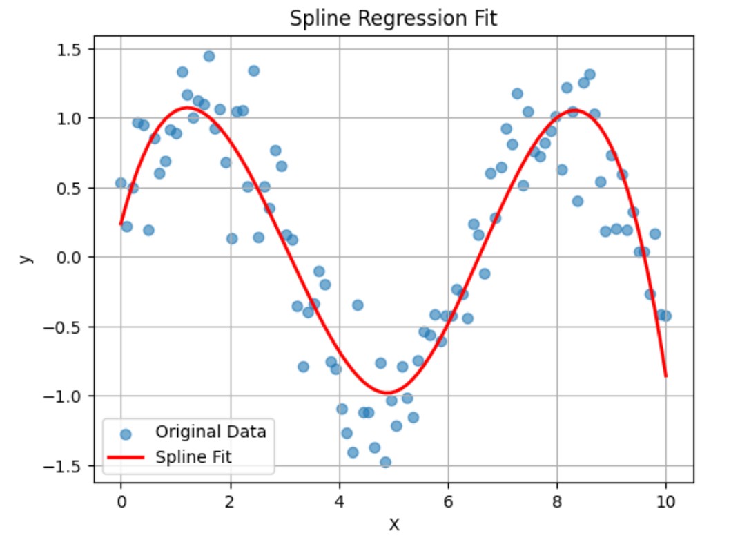
(4) Use Splines or Piecewise Regression
Splines are flexible, piecewise polynomials used to model non-linear data. Unlike simple polynomials, they avoid overfitting and work well with smooth curves.
import numpy as np
import pandas as pd
import matplotlib.pyplot as plt
import statsmodels.api as sm
from patsy import dmatrix

# Create synthetic non-linear data
np.random.seed(0)
X = np.linspace(0, 10, 100)
y = np.sin(X) + np.random.normal(scale=0.3, size=X.shape)

# Create spline basis with 4 degrees of freedom
transformed_X = dmatrix("bs(x, df=4, degree=3, include_intercept=False)", {"x": X}, return_type='dataframe')

# Fit a linear model on the spline-transformed features
model = sm.OLS(y, transformed_X).fit()

# Predict
y_pred = model.predict(transformed_X)

# Plot
plt.scatter(X, y, label="Original Data", alpha=0.6)
plt.plot(X, y_pred, color='red', label="Spline Fit", linewidth=2)
plt.legend()
plt.xlabel("X")
plt.ylabel("y")
plt.title("Spline Regression Fit")
plt.grid(True)
plt.show()