Seaborn – Count Plot Visualization
Table Of Contents:
- What Is Count Plot ?
- Where To Use Count Plot ?
- Examples Of Count Plot ?
(1) What Is Count Plot ?
- A count plot is a type of bar plot that shows the count (frequency) of occurrences of different categories in a dataset.
- It is useful when you want to visualize categorical data and see how often each category appears.

(2) Where To Use Count Plot ?

(3) Example Of Count Plot.
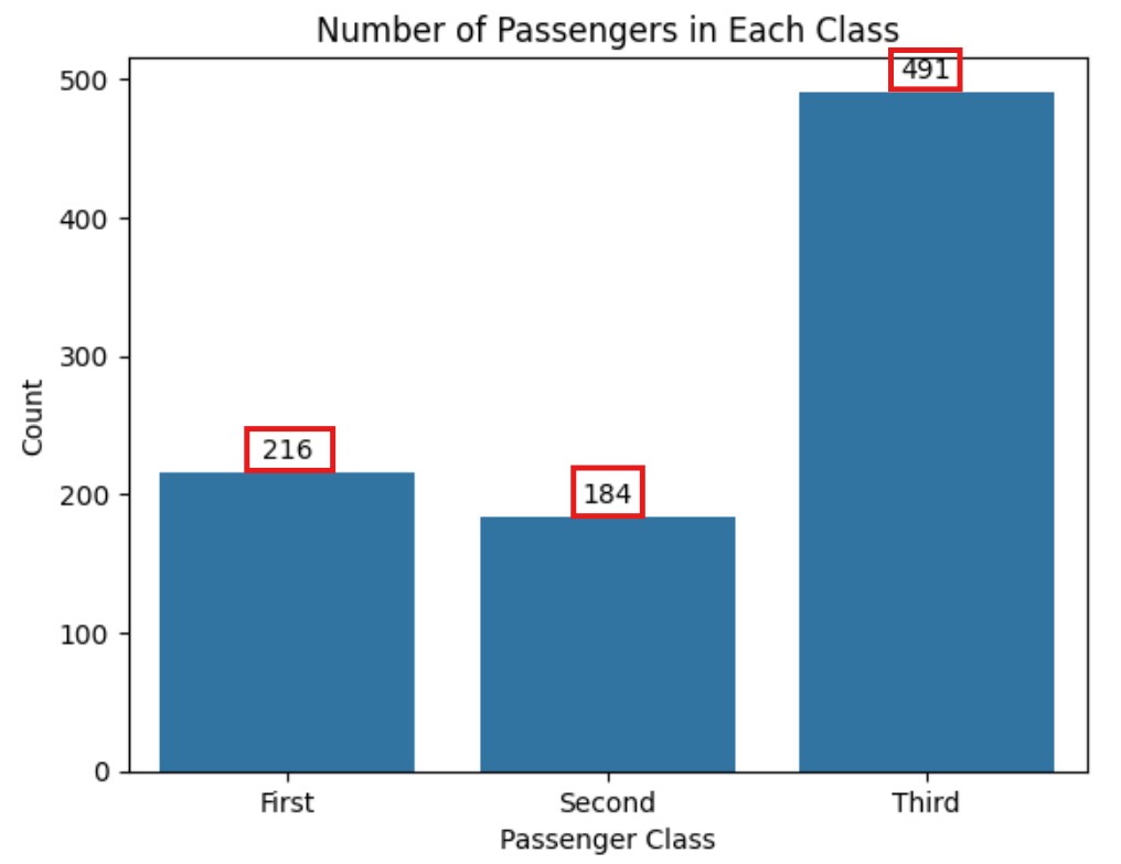
Example-1: Titanic Passenger Class Vs Count.
import seaborn as sns
import matplotlib.pyplot as plt

# Load the Titanic dataset
titanic = sns.load_dataset("titanic")

# Create the count plot
ax = sns.countplot(data=titanic, x="class")

# Adding Labels At The Top Of The Bar
ax.bar_label(ax.containers[0], fmt = '%.0f',  padding = 3, label_type = 'edge')

# Add labels and title
plt.xlabel("Passenger Class")
plt.ylabel("Count")
plt.title("Number of Passengers in Each Class")

# Show the plot
plt.show()

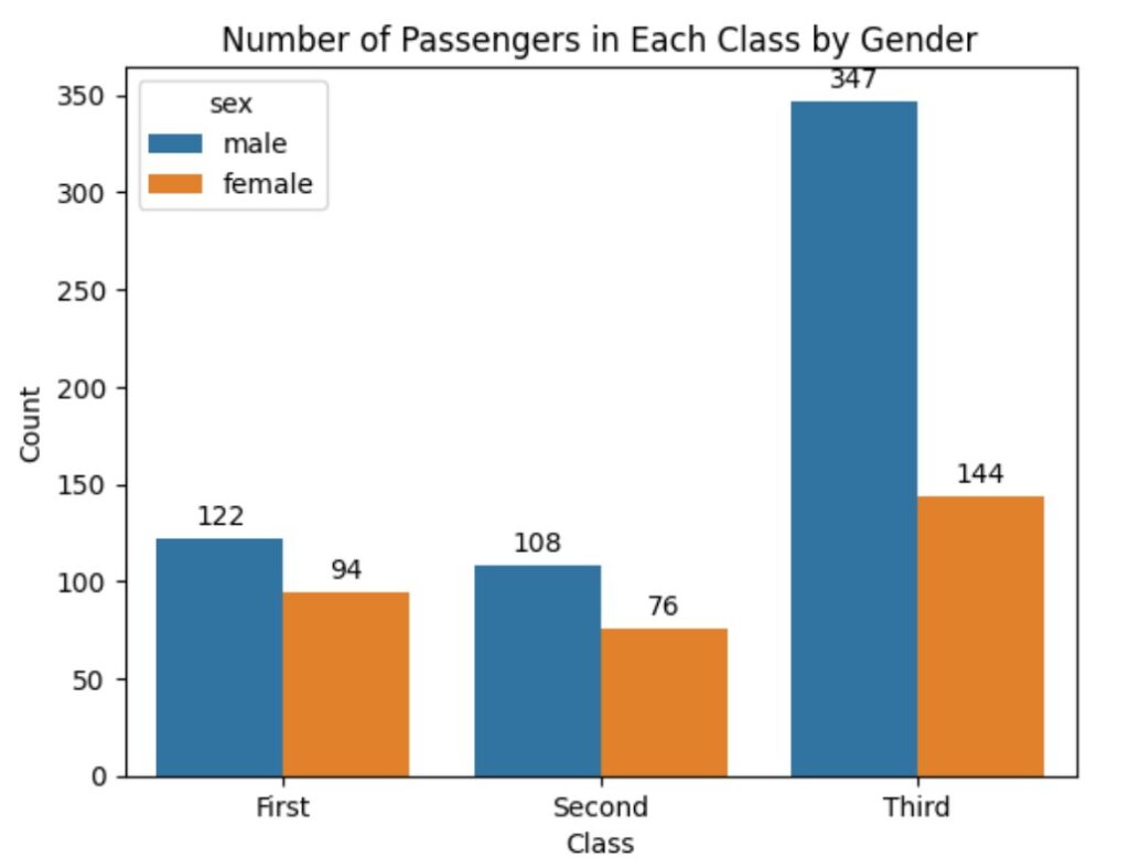
Example-2: Number of Passengers in Each Class by Gender
import seaborn as sns
import matplotlib.pyplot as plt

titanic = sns.load_dataset('titanic')

ax = sns.countplot(data = titanic, x = 'class', hue = 'sex')

ax.bar_label(ax.containers[0], fmt = '%.0f', padding = 3, label_type = 'edge')
ax.bar_label(ax.containers[1], fmt = '%.0f', padding = 3, label_type = 'edge')

plt.title('Number of Passengers in Each Class by Gender')
plt.xlabel('Class')
plt.ylabel('Count')
plt.show()

