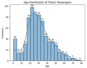
Example-1: Age Distribution of Titanic Passengers.
import seaborn as sns
import matplotlib.pyplot as plt

# Load the Titanic dataset
titanic = sns.load_dataset("titanic")

# Create the histogram for age
ax = sns.histplot(data=titanic, x="age", bins=20, kde=True)

ax.bar_label(ax.containers[0], fmt = '%.0f', padding = 3, label_type = 'edge')

# Add labels and title
plt.xlabel("Age")
plt.ylabel("Frequency")
plt.title("Age Distribution of Titanic Passengers")

# Show the plot
plt.show()
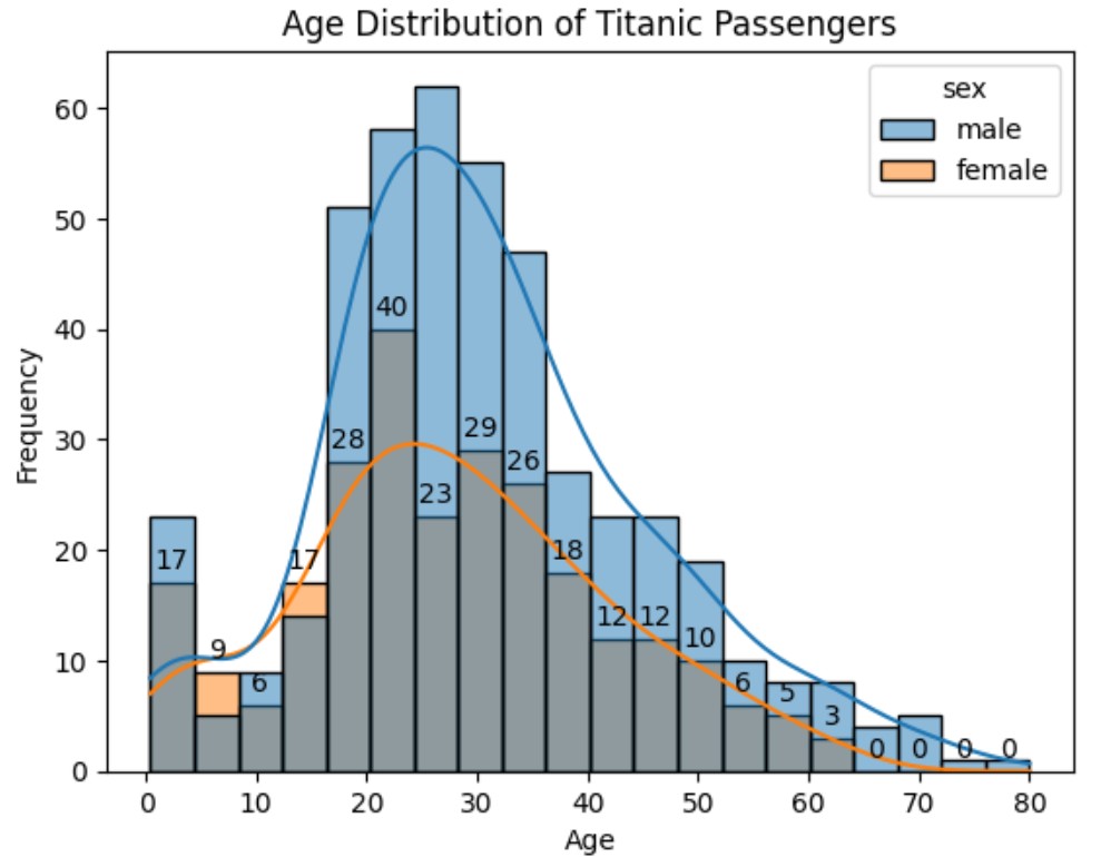
Example-2: Age Distribution of Titanic Passengers By Gender
import seaborn as sns
import matplotlib.pyplot as plt

# Load the Titanic dataset
titanic = sns.load_dataset("titanic")

# Create the histogram for age
ax = sns.histplot(data=titanic, x="age", hue = 'sex', bins=20, kde=True)

ax.bar_label(ax.containers[0], fmt = '%.0f', padding = 3, label_type = 'edge')

# Add labels and title
plt.xlabel("Age")
plt.ylabel("Frequency")
plt.title("Age Distribution of Titanic Passengers By Gender")

# Show the plot
plt.show()
Note:
bin = 20 means there will be 20 number of bars in the Histogram plot.
If we increase the bin size then the bar count will also increase.