A line plot is a type of graph that shows how something changes over time or along a continuous variable.
It connects data points with a line to show trends and patterns.
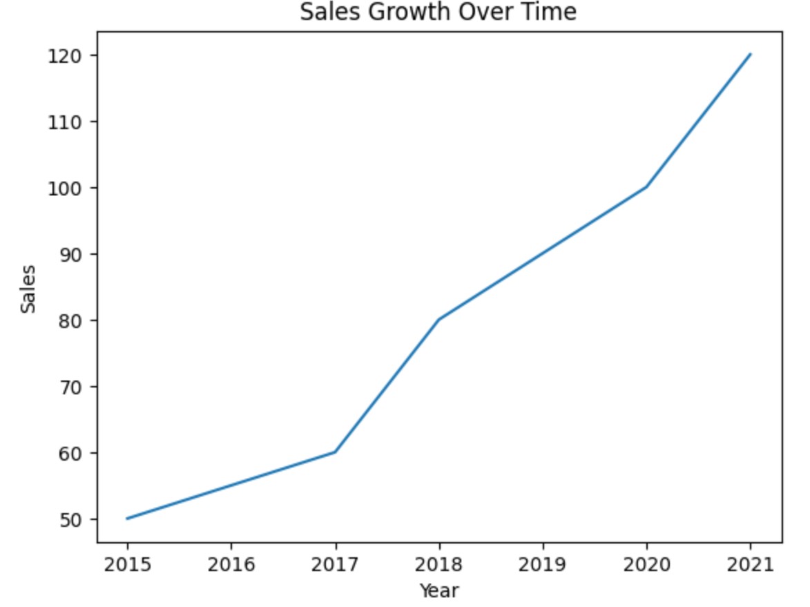
Example-1: Basic Line Plot
import seaborn as sns
import matplotlib.pyplot as plt

# Sample Data
data = {
    "year": [2015, 2016, 2017, 2018, 2019, 2020, 2021],
    "sales": [50, 55, 60, 80, 90, 100, 120]
}

# Create the plot
sns.lineplot(x=data["year"], y=data["sales"])

# Show the plot
plt.title("Sales Growth Over Time")
plt.xlabel("Year")
plt.ylabel("Sales")
plt.show()
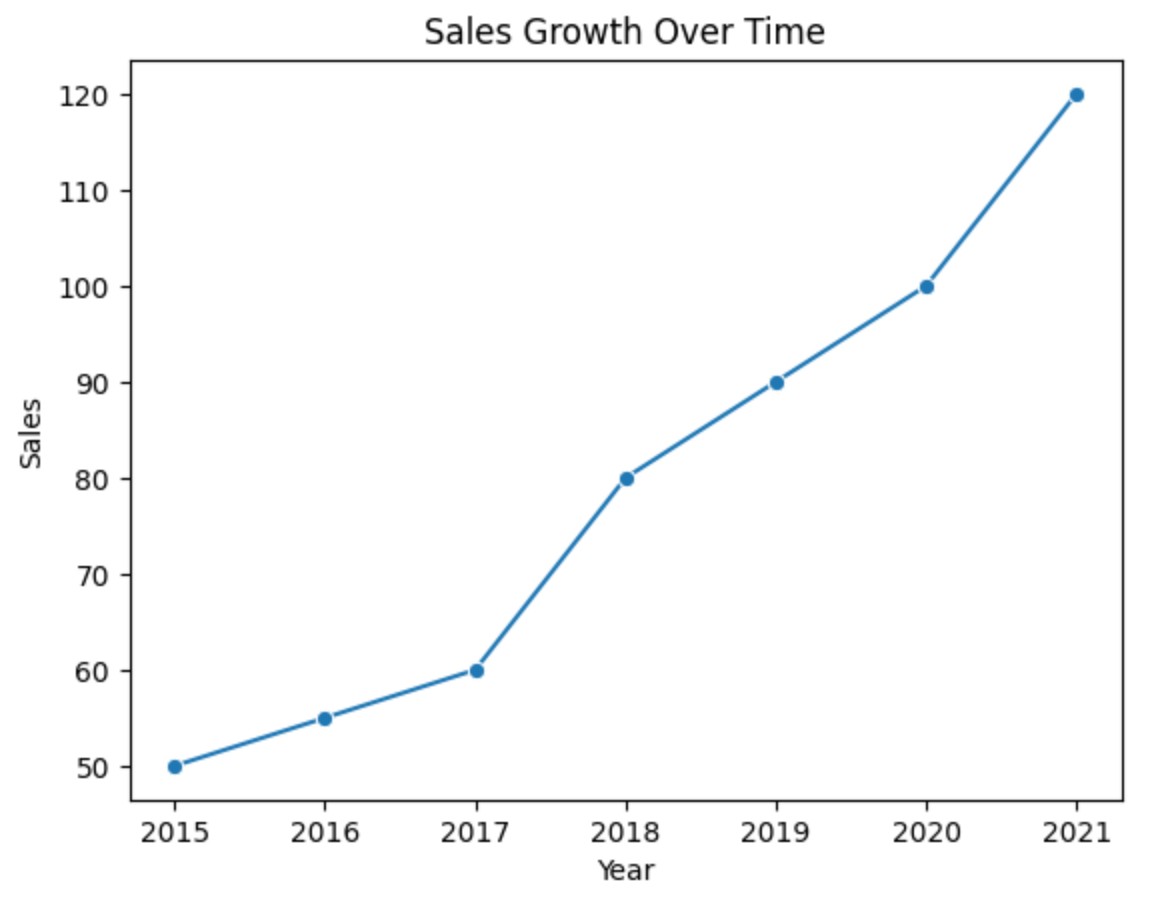
Example-2: Line Plot With Marker
import seaborn as sns
import matplotlib.pyplot as plt

# Sample Data
data = {
    "year": [2015, 2016, 2017, 2018, 2019, 2020, 2021],
    "sales": [50, 55, 60, 80, 90, 100, 120]
}

# Create the plot
sns.lineplot(x=data["year"], y=data["sales"], marker = 'o')

# Show the plot
plt.title("Sales Growth Over Time")
plt.xlabel("Year")
plt.ylabel("Sales")
plt.show()
Example-3: Line Plot With Built In Dataset
import seaborn as sns
import matplotlib.pyplot as plt

# Load Seaborn's built-in "flights" dataset
flights = sns.load_dataset("flights")

# Create a line plot of passengers over the years
sns.lineplot(data=flights, x="year", y="passengers", hue="month")

plt.title("Number of Airline Passengers Over Time")
plt.show()
‘hue’ is used to compare subcategories within each main category.