Seaborn – Scatter Plot Visualization
Table Of Contents:
- What Is Scatter Plot?
- Example Of Scatter Plot.
(1) What Is Scatter Plot ?
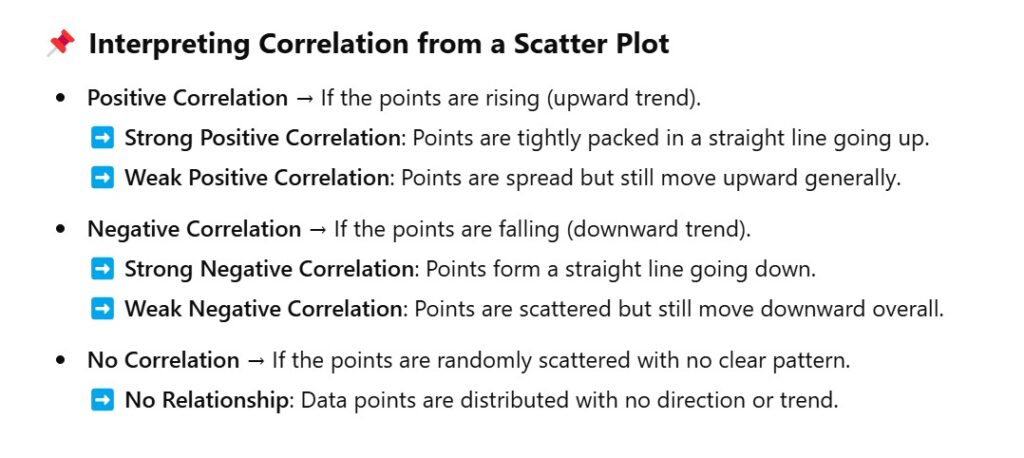
- A scatter plot visually represents the relationship between two numerical variables.
- It helps you see if there is a correlation (positive, negative, or none) between them based on how the data points are spread out.
- The pattern or distribution of the points gives you insights into the correlation.
- Best when comparing two independent variables without time dependency.
Example-1: Total Bill vs Tips
import seaborn as sns
import matplotlib.pyplot as plt

# Load Seaborn Builtin 'tips' Dataset
tips = sns.load_dataset('tips')

# Create A Scatter Plot
sns.scatterplot(data= tips, x = 'total_bill', y = 'tip')

plt.title('Scatter Plot: Total Bills Vs Tips')
plt.show()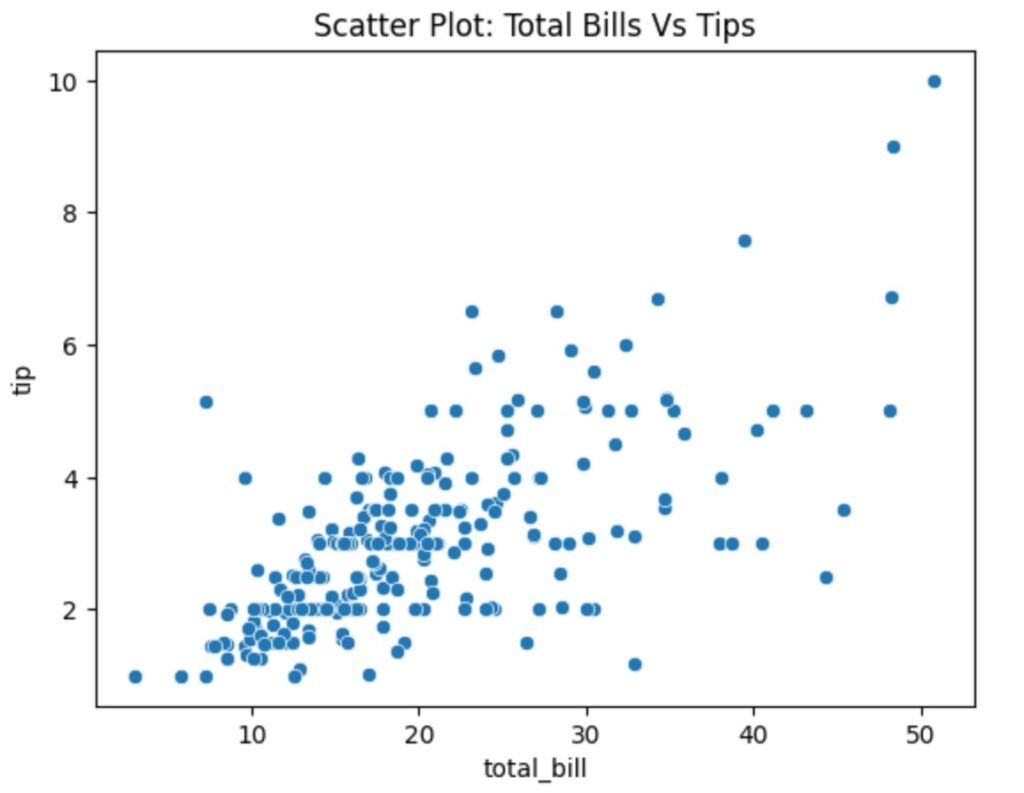
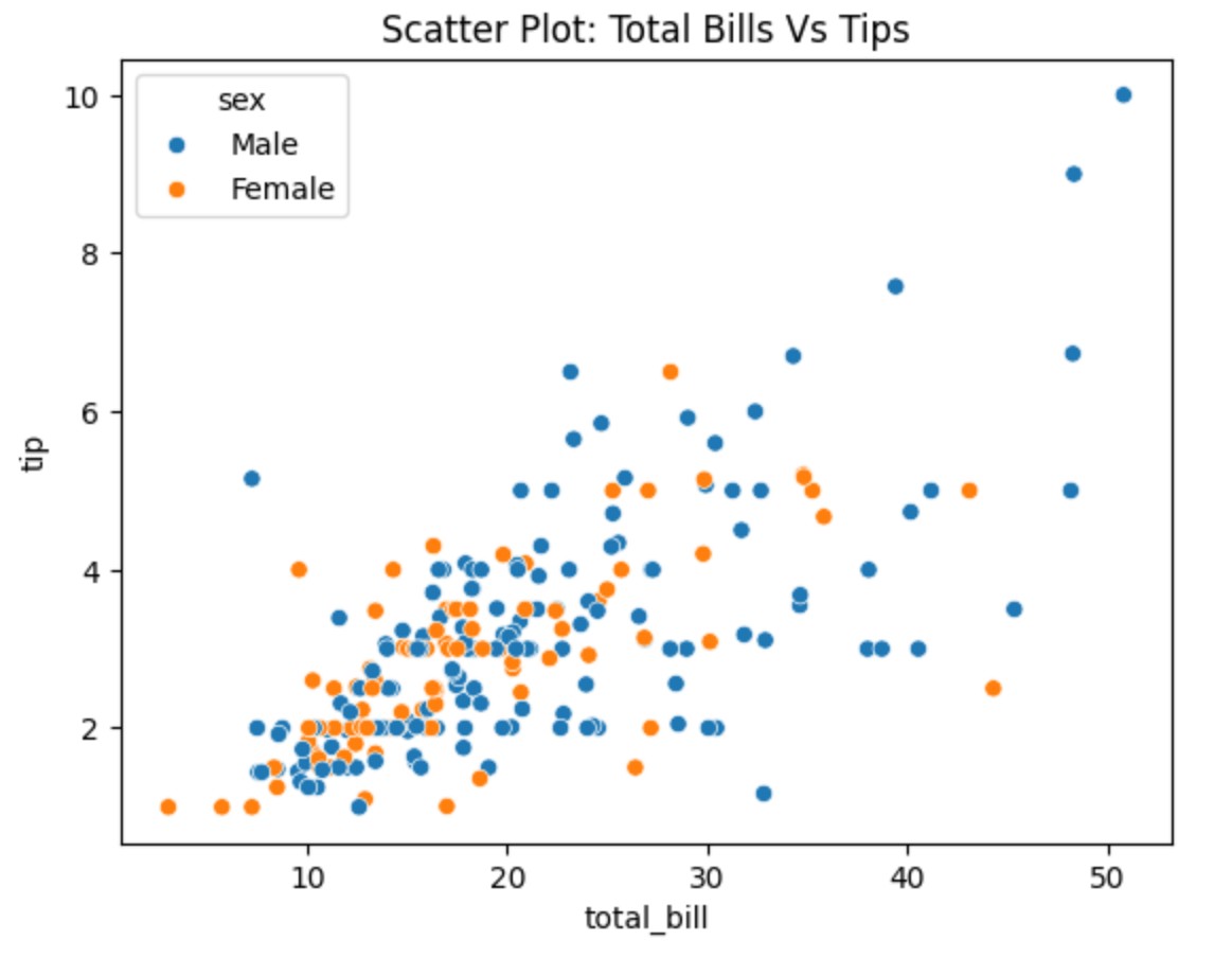
Example-2: Total Bill vs Tips With Hue.
import seaborn as sns
import matplotlib.pyplot as plt

# Load Seaborn Builtin 'tips' Dataset
tips = sns.load_dataset('tips')

# Create A Scatter Plot
sns.scatterplot(data= tips, x = 'total_bill', y = 'tip', hue = 'sex')

plt.title('Scatter Plot: Total Bills Vs Tips')
plt.show()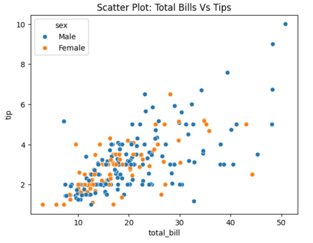
- Scatter Plot is used to find the correlation between variables.
- Positive Correlation
- Negative Correlation
- No Correlation
Example-3: Positive Auto Correlation
import seaborn as sns
import matplotlib.pyplot as plt

# Load real dataset
tips = sns.load_dataset("tips")

# Create Scatter Plot
sns.scatterplot(data=tips, x="total_bill", y="tip")

plt.title("Scatter Plot: Total Bill vs. Tip (Positive Correlation)")
plt.xlabel("Total Bill ($)")
plt.ylabel("Tip Amount ($)")
plt.show()
- Explanation: As study hours increase, exam scores also increase. The plot will show a rising trend.
Example-4: Negative Auto Correlation
import seaborn as sns
import matplotlib.pyplot as plt
import pandas as pd
import numpy as np

# Generate synthetic real-world-like data
np.random.seed(42)
age = np.random.randint(20, 80, 100)  # Age between 20 and 80
max_heart_rate = 220 - age + np.random.randint(-5, 5, 100)  # Max HR decreases with age

# Create DataFrame
df = pd.DataFrame({"Age": age, "Max Heart Rate": max_heart_rate})

# Create Scatter Plot
sns.scatterplot(data=df, x="Age", y="Max Heart Rate")

plt.title("Scatter Plot: Age vs. Max Heart Rate (Negative Correlation)")
plt.xlabel("Age (Years)")
plt.ylabel("Max Heart Rate (bpm)")
plt.show()
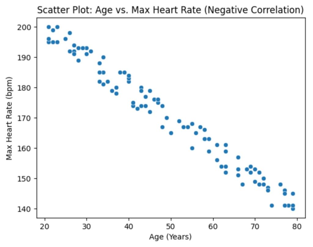
Interpretation:
✔ Downward trend: As age increases, max heart rate decreases.
✔ This suggests a strong negative correlation (older people tend to have lower max heart rates).
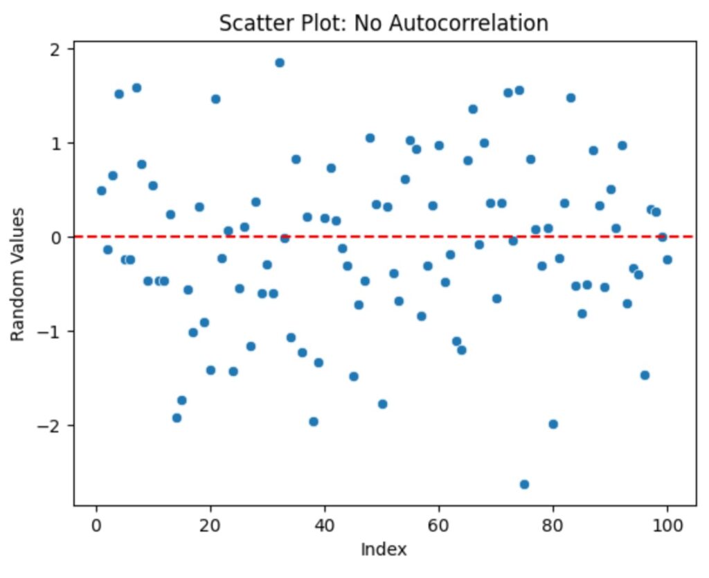
Example-5: No Auto Correlation
import numpy as np
import matplotlib.pyplot as plt
import seaborn as sns

# Generate random independent data (no autocorrelation)
np.random.seed(42)
x = np.arange(1, 101)  # Time or index values
y = np.random.normal(0, 1, 100)  # Random values (mean=0, std=1)

# Scatter plot
sns.scatterplot(x=x, y=y)
plt.axhline(y=0, color='red', linestyle='--')  # Reference line at y=0

plt.title("Scatter Plot: No Autocorrelation")
plt.xlabel("Index")
plt.ylabel("Random Values")
plt.show()