-
Seaborn – Scatter Plot Visualization
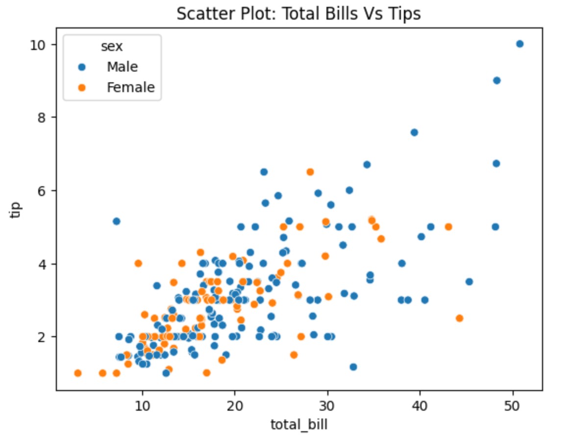
Seaborn – Scatter Plot Visualization Table Of Contents: What Is Scatter Plot? Example Of Scatter Plot. (1) What Is Scatter Plot ? A scatter plot visually represents the relationship between two numerical variables. It helps you see if there is a correlation (positive, negative, or none) between them based on how the data points are spread out. The pattern or distribution of the points gives you insights into the correlation. Best when comparing two independent variables without time dependency. Example-1: Total Bill vs Tips import seaborn as sns import matplotlib.pyplot as plt # Load Seaborn Builtin 'tips' Dataset tips =