-
Seaborn – Changing colors & Palettes
-
Seaborn – Polynomial Regression Trend Visualization
-
Seaborn – Logistic Regression Visualization
-
Seaborn – Linear Regression Plot Visualization
-
Seaborn – Heatmap Plot Visualization
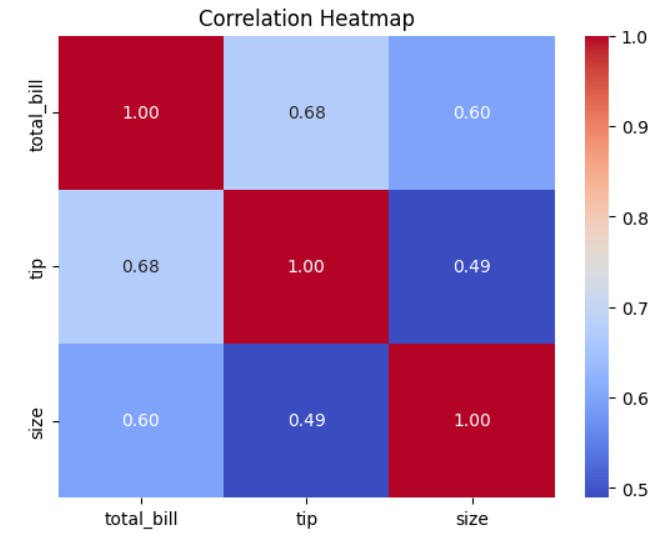
Seaborn – Heatmap Plot Visualization Table Of Contents: What Is Heatmap Plot ? Where To Use Heatmap Plot ? Examples Of Heatmap Plot ? (1) What Is Heatmap Plot ? (2) Where To Use Heatmap Plot ? (3) Examples Of Heatmap Plot ? Example-1: Basic Heatmap for Correlation Matrix import seaborn as sns import matplotlib.pyplot as plt # Load built-in dataset tips = sns.load_dataset("tips") # Keep only numeric columns tips_numeric = tips.select_dtypes(include="number") # Compute correlation matrix corr = tips_numeric.corr() # Create heatmap sns.heatmap(corr, annot=True, cmap="coolwarm", fmt=".2f") plt.title("Correlation Heatmap") plt.show() Example-2: Heatmap for Missing Values import numpy as np import pandas
-
Seaborn – Joint Plot Visualization
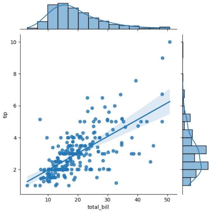
Seaborn – Joint Plot Visualization Table Of Contents: What Is Joint Plot ? Where To Use Joint Plot ? Examples Of Joint Plot ? (1) What Is Joint Plot ? (2) Where to Use a Joint Plot? (3) Examples Of Joint Plot ? Example-1: Basic Joint Plot import seaborn as sns import matplotlib.pyplot as plt # Load built-in tips dataset tips = sns.load_dataset("tips") # Create a joint plot sns.jointplot(data=tips, x="total_bill", y="tip") plt.show() Example-2: Joint Plot with Regression Line (Kind=”reg”) import seaborn as sns import matplotlib.pyplot as plt # Load built-in tips dataset tips = sns.load_dataset("tips") # Create a joint plot
-
Seaborn – Pair Plot Visualization
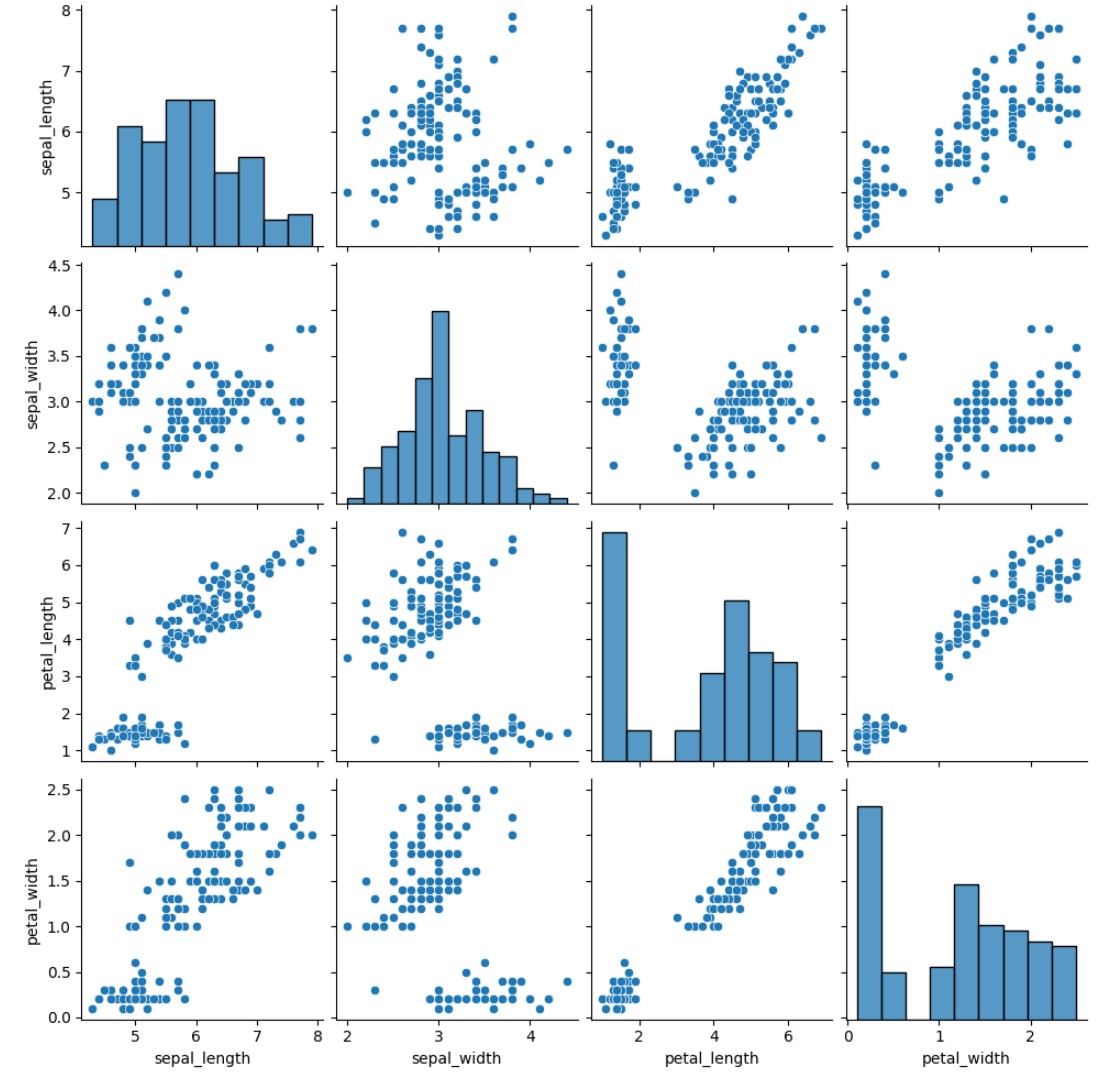
Seaborn – Pair Plot Visualization Table Of Contents: What Is Pair Plot ? Where To Use Pair Plot ? Examples Of Pair Plot ? (1) What Is Pair Plot ? (2) Where To Use Pair Plot ? (3) Examples Of Pair Plot ? Example-1: Basic Pair Plot import seaborn as sns import matplotlib.pyplot as plt # Load built-in Iris dataset iris = sns.load_dataset("iris") # Create a pair plot sns.pairplot(iris) plt.show() Example-2: Pair Plot with Hue (Coloring by Category) import seaborn as sns import matplotlib.pyplot as plt # Load built-in Iris dataset iris = sns.load_dataset("iris") # Create a pair plot sns.pairplot(iris,
-
Seaborn – Swarm Plot Visualization
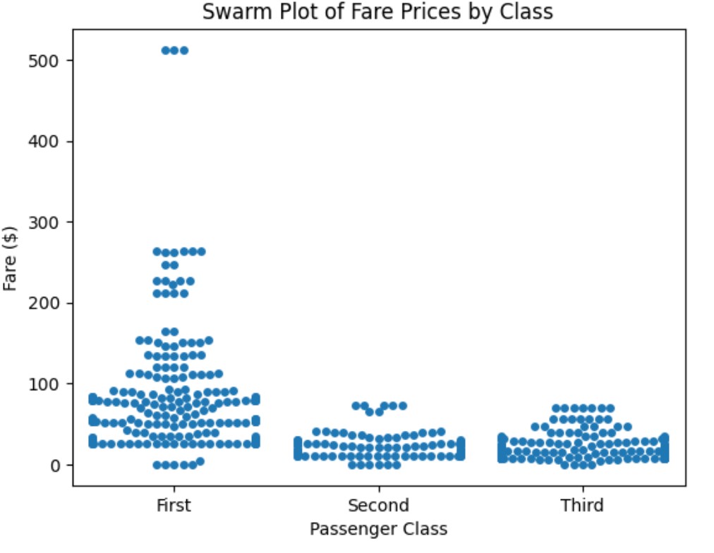
Seaborn – Swarm Plot Visualization Table Of Contents: What Is Swarm Plot ? Where To Use Swarm Plot ? Examples Of Swarm Plot ? (1) What Is Swarm Plot ? (2) Where To Use Swarm Plot ? (3) Examples Of Swarm Plot ? Example-1: Swarm Plot of Fare Prices by Class import seaborn as sns import matplotlib.pyplot as plt # Load Titanic dataset titanic = sns.load_dataset("titanic") # Create a swarm plot for fare distribution sns.swarmplot(data=titanic, x="class", y="fare") plt.xlabel("Passenger Class") plt.ylabel("Fare ($)") plt.title("Swarm Plot of Fare Prices by Class") plt.show() Example-2: Swarm Plot with Hue (Gender Comparison) import seaborn as sns
-
Seaborn – Strip Plot Visualization
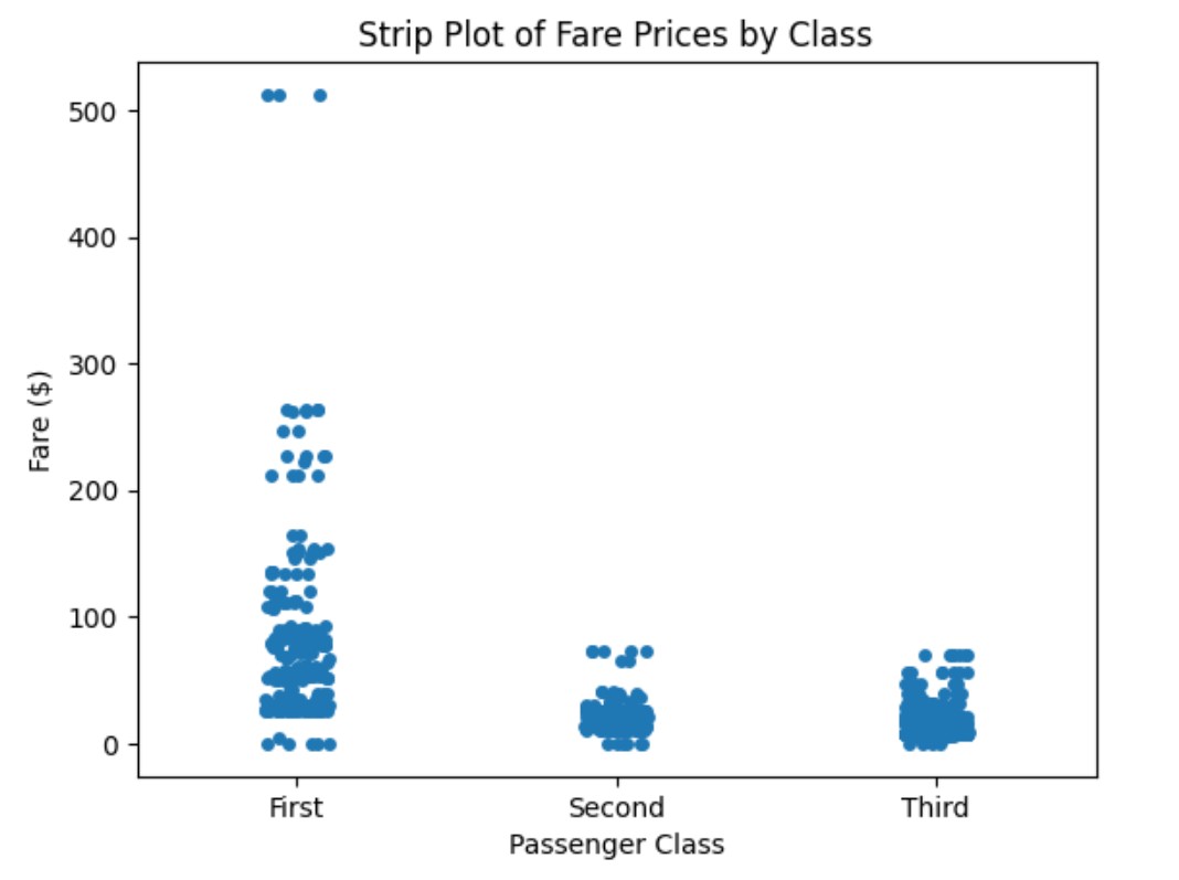
Seaborn – Strip Plot Visualization Table Of Contents: What Is Strip Plot ? Where To Use Strip Plot ? Examples Of Strip Plot ? (1) What Is Strip Plot ? (2) Where To Use Strip Plot ? (3) Examples Of Strip Plot ? Example-1: Strip Plot of Fare Prices by Class import seaborn as sns import matplotlib.pyplot as plt # Load Titanic dataset titanic = sns.load_dataset("titanic") # Create a strip plot for fare sns.stripplot(data=titanic, x="class", y="fare", jitter=False) plt.xlabel("Passenger Class") plt.ylabel("Fare ($)") plt.title("Strip Plot of Fare Prices by Class") plt.show() Example-2: Strip Plot with Jitter (Spreading Out Points) import seaborn as