-
Seaborn – Violin Plot Visualization
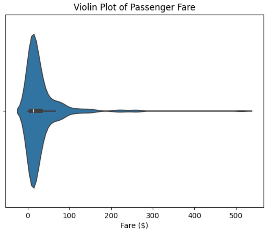
Seaborn – Violin Plot Visualization Table Of Contents: What Is Violin Plot ? Where To Use Violin Plot ? Examples Of Violin Plot ? (1) What Is Violin Plot ? (2) Where To Use Violin Plot ? (3) Examples Of Violin Plot. Example-1: Basic Violin Plot import seaborn as sns import matplotlib.pyplot as plt # Load Titanic dataset titanic = sns.load_dataset("titanic") # Create a violin plot for passenger fare sns.violinplot(data=titanic, x="fare") plt.xlabel("Fare ($)") plt.title("Violin Plot of Passenger Fare") plt.show() Example-2: Comparing Fare Distribution Across Passenger Classes import seaborn as sns import matplotlib.pyplot as plt # Load Titanic dataset titanic =
-
Seaborn – Box Plot Visualization
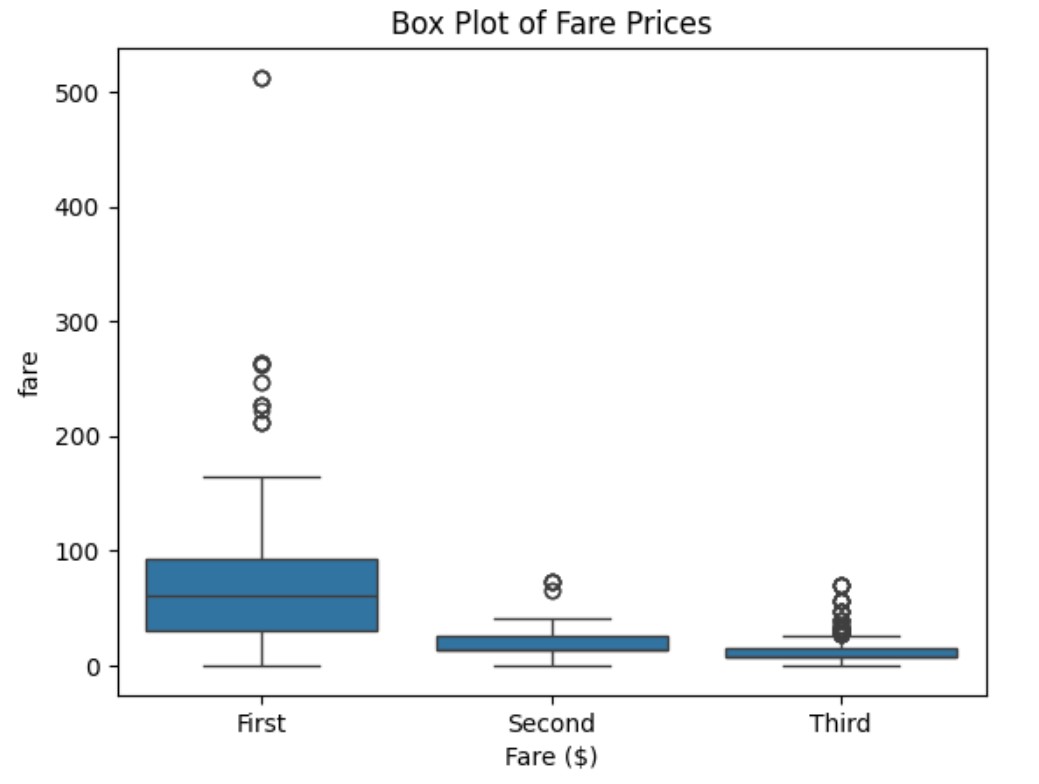
Seaborn – Box Plot Visualization Table Of Contents: What Is Box Plot ? Where To Use Box Plot ? Examples Of Box Plot ? (1) What Is Box Plot ? (2) Where To Use Box Plot ? (3) Examples Of Box Plot ? Example-1: Box Plot of Fare Prices import seaborn as sns import matplotlib.pyplot as plt # Load Titanic dataset titanic = sns.load_dataset("titanic") # Create Box Plot for fare sns.boxplot(data=titanic, x="fare") plt.xlabel("Fare ($)") plt.title("Box Plot of Fare Prices") plt.show() Example-2: Box Plot Comparing Passenger Classes import seaborn as sns import matplotlib.pyplot as plt # Load Titanic dataset titanic =
-
Seaborn – KDE Plot Visualization
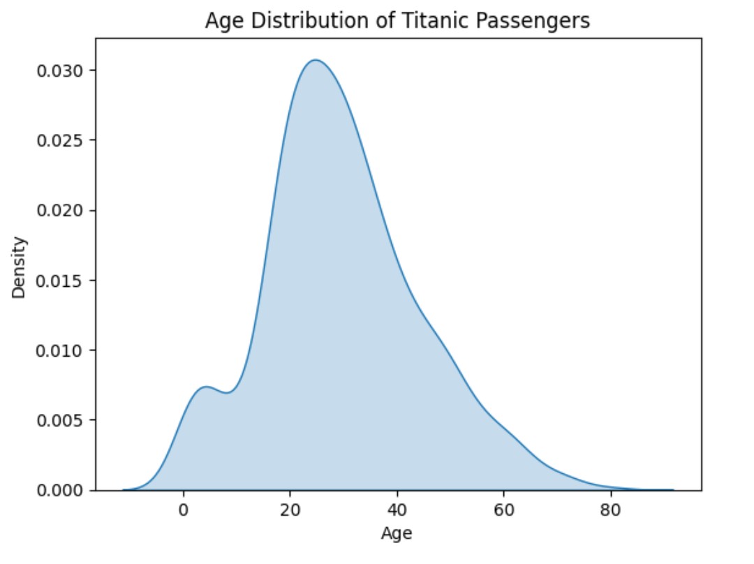
Seaborn – KDE Plot Visualization Table Of Contents: What Is KDE Plot ? Where To Use KDE Plot ? Examples Of KDE Plot ? (1) What Is KDE Plot ? (2) What Is Kernel ? (3) What Is Density ? (4) Where To Use KDE Plot ? (4) Examples Of KDE Plot. Example-1: Age Distribution of Titanic Passengers import seaborn as sns import matplotlib.pyplot as plt # Load the Titanic dataset titanic = sns.load_dataset("titanic") # Create KDE plot for age sns.kdeplot(data=titanic, x="age", fill=True) # Add labels and title plt.xlabel("Age") plt.ylabel("Density") plt.title("Age Distribution of Titanic Passengers") # Show the plot plt.show()
-
Seaborn – Histogram Plot Visualization
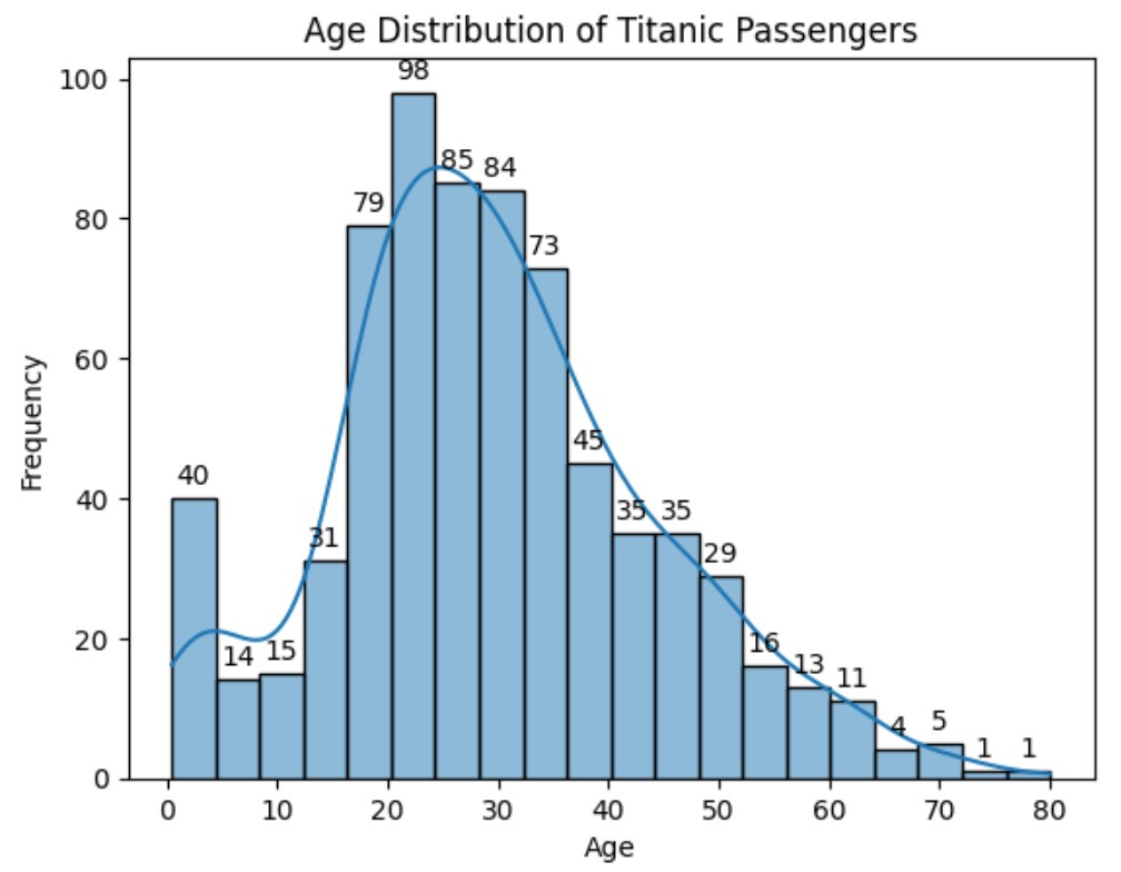
Seaborn – Histogram Plot Visualization Table Of Contents: What Is Histogram Plot ? Where To Use Histogram Plot ? Examples Of Histogram Plot ? (1) What Is Histogram Plot ? (2) Where To Use Histogram Plot ? (3) Examples Of Histogram Plot. Example-1: Age Distribution of Titanic Passengers. import seaborn as sns import matplotlib.pyplot as plt # Load the Titanic dataset titanic = sns.load_dataset("titanic") # Create the histogram for age ax = sns.histplot(data=titanic, x="age", bins=20, kde=True) ax.bar_label(ax.containers[0], fmt = '%.0f', padding = 3, label_type = 'edge') # Add labels and title plt.xlabel("Age") plt.ylabel("Frequency") plt.title("Age Distribution of Titanic Passengers") # Show
-
Seaborn – Count Plot Visualization
Seaborn – Count Plot Visualization Table Of Contents: What Is Count Plot ? Where To Use Count Plot ? Examples Of Count Plot ? (1) What Is Count Plot ? A count plot is a type of bar plot that shows the count (frequency) of occurrences of different categories in a dataset. It is useful when you want to visualize categorical data and see how often each category appears. (2) Where To Use Count Plot ? (3) Example Of Count Plot. Example-1: Titanic Passenger Class Vs Count. import seaborn as sns import matplotlib.pyplot as plt # Load the Titanic dataset
-
Seaborn – Bar Plot Visualization
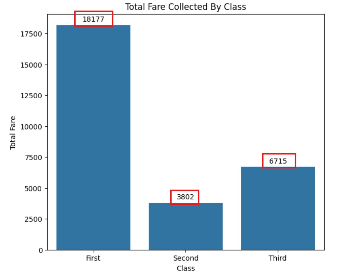
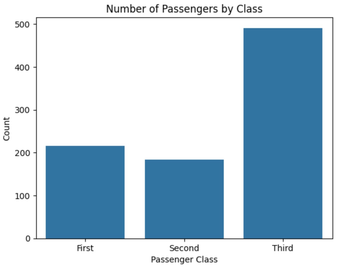
Seaborn – Bar Plot Visualization Table Of Contents: What Is Bar Plot ? Where To Use Bar Plot ? Examples Of Bar Plot ? (1) What Is Bar Plot ? Note : The Bar Plot mainly used to summarize the categorical variable. (2) Where to Use a Bar Plot ? (3) Example Of Bar Plot ? Example-1: Titanic Passenger Class Vs Count. import seaborn as sns import matplotlib.pyplot as plt # Load dataset titanic = sns.load_dataset("titanic") # Create Bar Plot (Count of passengers by class) sns.barplot(x=titanic["class"].value_counts().index, y=titanic["class"].value_counts().values) plt.title("Number of Passengers by Class") plt.xlabel("Passenger Class") plt.ylabel("Count") plt.show() Example-2: Bar PLOT With
-
Seaborn – Scatter Plot Visualization
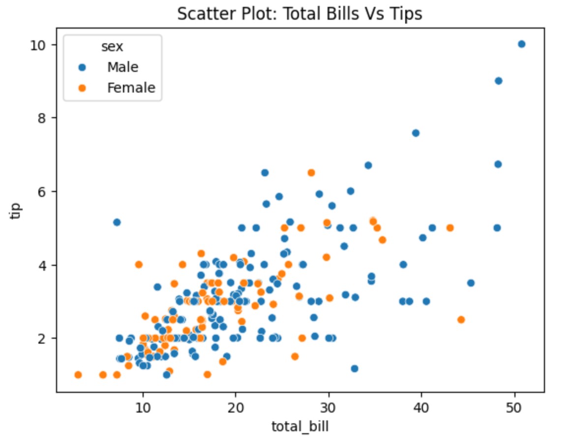
Seaborn – Scatter Plot Visualization Table Of Contents: What Is Scatter Plot? Example Of Scatter Plot. (1) What Is Scatter Plot ? A scatter plot visually represents the relationship between two numerical variables. It helps you see if there is a correlation (positive, negative, or none) between them based on how the data points are spread out. The pattern or distribution of the points gives you insights into the correlation. Best when comparing two independent variables without time dependency. Example-1: Total Bill vs Tips import seaborn as sns import matplotlib.pyplot as plt # Load Seaborn Builtin 'tips' Dataset tips =
-
Seaborn – Line Plot Visualization
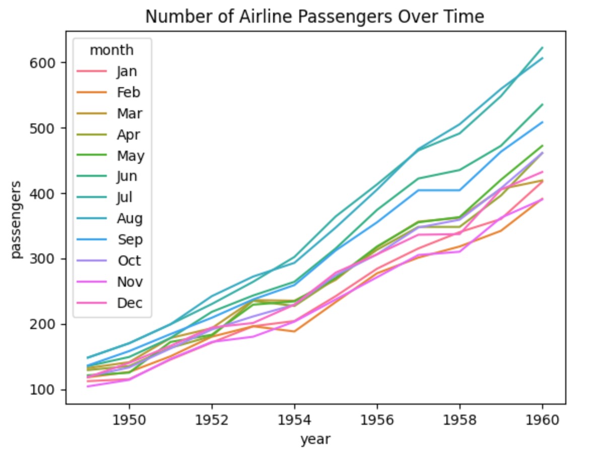
Seaborn – Line Plot Visualization Table Of Contents: What Is Line Plot? Example Of Line Plot. (1) What Is Line Plot ? A line plot is a type of graph that shows how something changes over time or along a continuous variable. It connects data points with a line to show trends and patterns. Example-1: Basic Line Plot import seaborn as sns import matplotlib.pyplot as plt # Sample Data data = { "year": [2015, 2016, 2017, 2018, 2019, 2020, 2021], "sales": [50, 55, 60, 80, 90, 100, 120] } # Create the plot sns.lineplot(x=data["year"], y=data["sales"]) # Show the plot plt.title("Sales
-

Seaborn – Basic Plot Types
Seaborn – Basic Plot Types Table Of Contents: Line Plot (sns.lineplot()) Scatter Plot (sns.scatterplot()) Bar Plot (sns.barplot()) Count Plot (sns.countplot()) Histogram (sns.histplot()) KDE Plot (sns.kdeplot()) (1) Line Plot (sns.lineplot()) A line plot is a type of graph that shows how something changes over time or along a continuous variable. It connects data points with a line to show trends and patterns. Example-1: Basic Line Plot import seaborn as sns import matplotlib.pyplot as plt # Sample Data data = { "year": [2015, 2016, 2017, 2018, 2019, 2020, 2021], "sales": [50, 55, 60, 80, 90, 100, 120] } # Create the plot
-

Jupyter Lab Installation
Jupyter Lab Installation Table Of Contents: Download & Install Python. Verify Python Installation. Verify ‘pip’ Installation. Install JupyterLab. Verify JupyterLab Installation. Run JupyterLab. (1) Download & Install Python Download the latest version of the Python from the below link. https://www.python.org/downloads/ (2) Verify Python Installation After download and install you need to verify whether its installed correctly or not. Open a command prompt and run the below command to verify the Python installation. python – version (3) Verify ‘pip’ Installation pip – version (4) Install JupyterLab. Once Python and pip are installed, install Jupyter Lab using: pip install jupyterlab (5) Verify